The Basics: The Header Navigation
Introduction to the header navigation
Back by popular demand, the latest Modern Campus CMS template offers a visible top navigation in addition to the standard side navigation. Check out the display options in the carousel below.
Please note: These options are optimal for sites with a small number of header menu items. Too
many items will cause wrapping issues and will most likely need to be shortened and/or
have the header navigation feature disabled.
Option 1: Header Navigation
Large Desktop Browser Window Display

Mid-Sized Desktop Browser Window Display

Option 2: Sub-Header Navigation

Option 3: Side Navigation Only

Option 1: Header Navigation
- Description: Menu is placed directly in the header title area. It will disappear on smaller browser windows.
- Ideal for: Sites with a small number of menu items that will fit in the header area of approximately 800px .
- Example: https://websites.it.utah.edu/guides-v3/index.php
Option 2: Sub-Header Navigation
- Description: The menu is placed below the header title area in a dark gray bar. It will disappear on smaller browser windows.
- Ideal for: Sites with more menu items than allowed in Option 1. Area is still limited, but will allow up to 1199px wide.
- Example: https://gradschool.utah.edu/
Option 3: Side Navigation Only
- Description: Similar to the V3 template with no top navigation.
- Ideal for: Sites that have several menu items.
Customizable header colors
Default - Taupe

Optional - University Red

Distinguishing header and submenu items
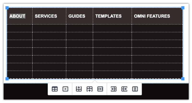
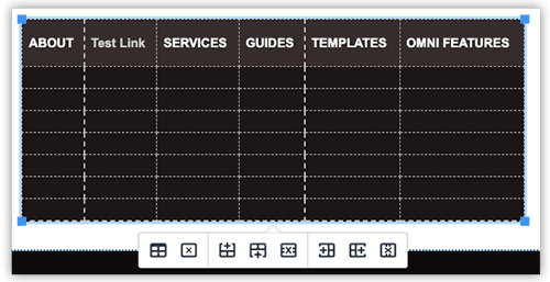
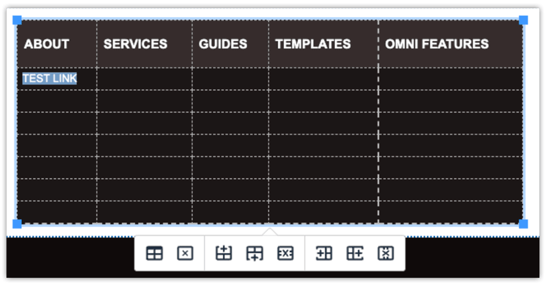
The header navigation is set up like a table in Modern Campus CMS and typically mirrors what is listed in the side navigation. Header menu items (also known as level 1 items in the side navigation) appear as header columns, with submenu items (also known as level 2 items in the side navigation) listed in the rows and columns below their corresponding headers.
On the front-end of a published site, if a header menu item is hovered over and contains submenu items, those submenu items will appear as a dropdown. If the header menu item has no submenu, clicking it will take you directly to another web page or document.
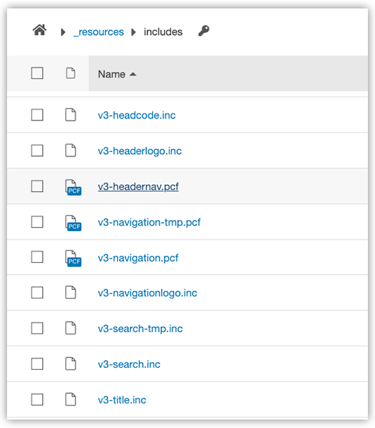
Adding header menu items
Step 1:
On the main level of your site, navigate to /_resources/includes, and open v3-headernav.pcf.
Step 2:
To add a new header menu item, click into one of the existing columns to the right or left of where you would like the new column to appear.
Step 3:
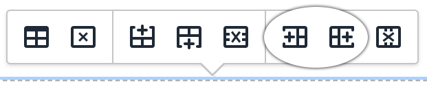
Using the quick icons menu, click the appropriate icon to add the column to the left or right of your existing column.
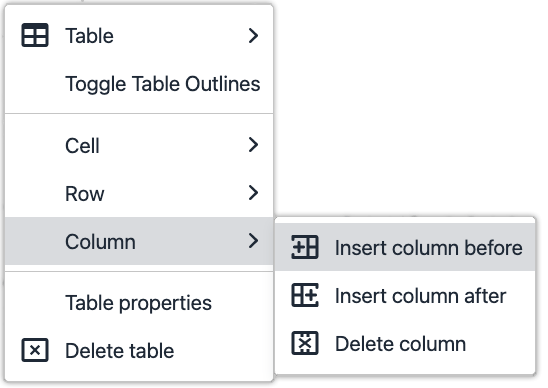
Or right click and go to Column→ Insert Column After or Insert Column Before.
Step 4:
Type a name for the new header menu item.
Please note: it is best to enter the text in title case or lowercase. The text will format automatically in a later step.
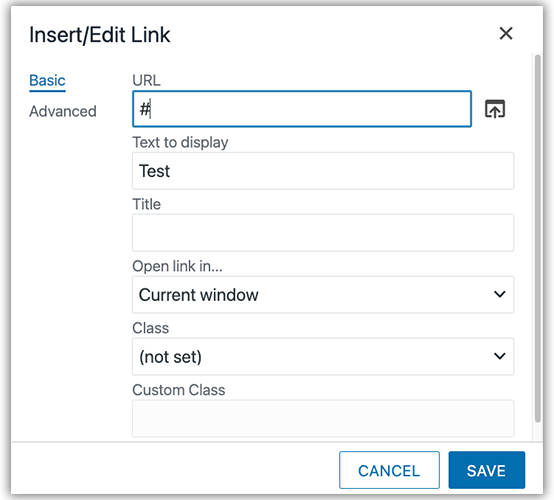
Step 5:
Highlight the text and then use the Insert/Edit Link icon in the WYSIWYG Toolbar to incorporate a link.
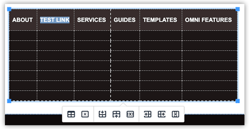
Step 6:
Once a link has been added, the text will format automatically.
Step 7:
Save and publish in order to view changes.

Step 8:
Open a new browser window and test the links to verify they are working correctly.
Adding submenu items
Step 1:
On the main level of your site, navigate to /_resources/includes, and open v3-headernav.pcf.
Step 2:
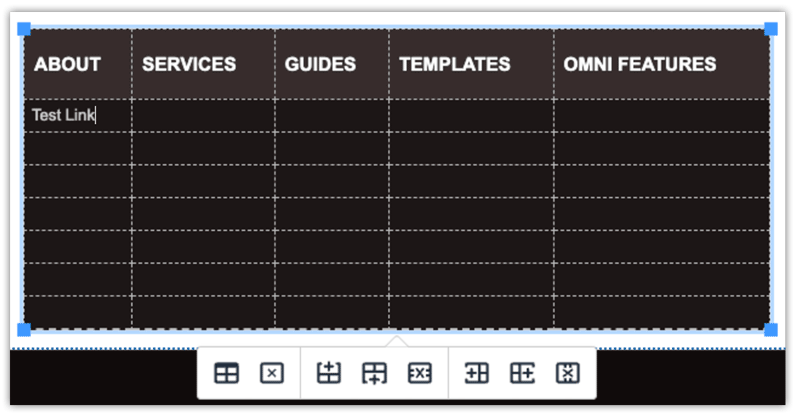
To add a new submenu item, place your cursor in the cell where you would like it to appear. Then type a name for the menu item.
Please note: it is best to enter the text in title case or lowercase. The text will format automatically in a later step.
Step 3:
Highlight the text and then use the Insert/Edit Link icon in the WYSIWYG Toolbar to incorporate a link.
Step 4:
Once a link has been added, the text will format in all capital letters automatically.
Step 5:
Save and publish in order to view changes.
Step 6:
Open a new browser window and test the links to verify they are working correctly.