Page Elements: Heading, Navigation, & Footer
Looking to make some subtle changes to your site? Check out the customized options below.
Customizable Top Navigation
Back by popular demand, the latest template offers a visible top navigation in addition to the standard side navigation. Check out the display options in the carousel below.
Option 1: Header Navigation
Large Desktop Browser Window Display

Mid-Sized Desktop Browser Window Display

Option 2: Sub-Header Navigation

Option 3: Side Navigation Only

Option 1: Header Navigation
- Description: Menu is placed directly in the header title area. It will disappear on smaller browser windows.
- Ideal for: Sites with a small number of menu items that will fit in the header area of approximately 800px .
- Example: https://websites.it.utah.edu/guides-v3/index.php
Option 2: Sub-Header Navigation
- Description: The menu is placed below the header title area in a dark gray bar. It will disappear on smaller browser windows.
- Ideal for: Sites with more menu items than allowed in Option 1. Area is still limited, but will allow up to 1199px wide.
- Example: https://gradschool.utah.edu/
Option 3: Side Navigation Only
- Description: Similar to the V3 template with no top navigation.
- Ideal for: Sites that have several menu items.
Customizable Header Colors
Default - Taupe

Optional - University Red

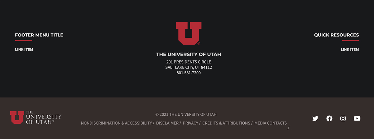
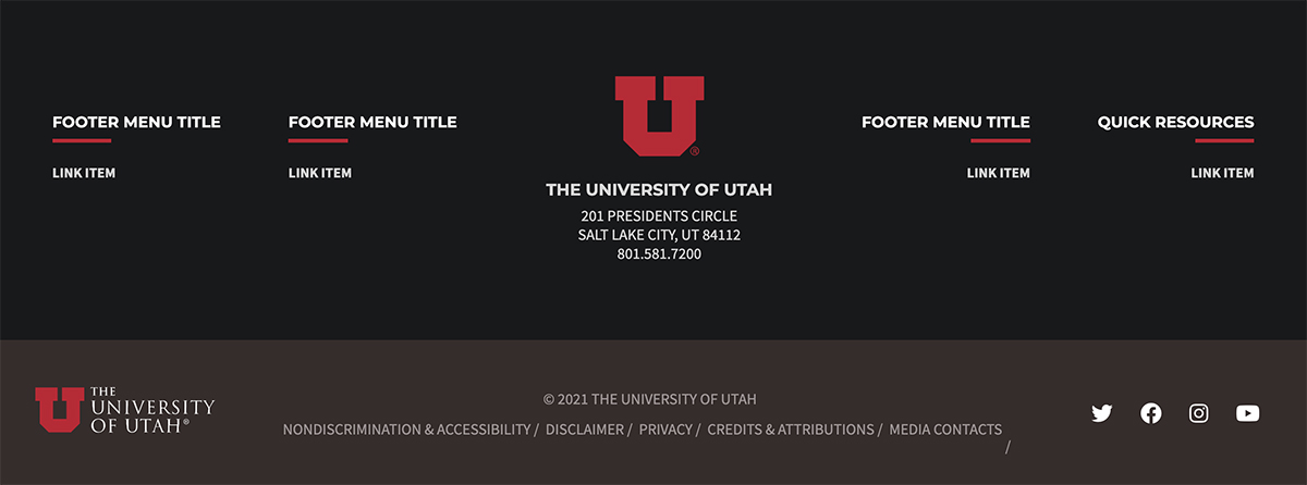
Customizable Footer Display Options
Choose between 2 or 4 columns with links.


