Designing vs. Redesigning a Webpage: A Step-by-Step Approach
Bits & Bytes Recap
Overview
Designing or redesigning a webpage can feel overwhelming, especially when determining where to start. Whether you’re building from the ground up or refining an existing page, following a structured design process ensures clarity and confidence. This guide outlines a step-by-step approach that applies to both new webpage designs and redesigns, helping you create functional and visually appealing pages.
Phase 1: Discovery
Before diving into the design, it’s crucial to establish a strong foundation by understanding the website’s objectives and audience.
Define Goals
- Department & Page Goals: Whether designing a new page or redesigning an existing one, understanding the overarching goals of your department’s website and how each page contributes to them is key. This knowledge will guide design decisions.
- Target Audience & Their Needs: A user-centered approach is essential. Knowing your audience and their expectations allows you to create a design that serves them effectively.
When redesigning, take time to evaluate the existing page. What’s working well? What needs improvement? Identify areas of confusion or inefficiency so that your redesign directly addresses user needs.
Phase 2: Planning
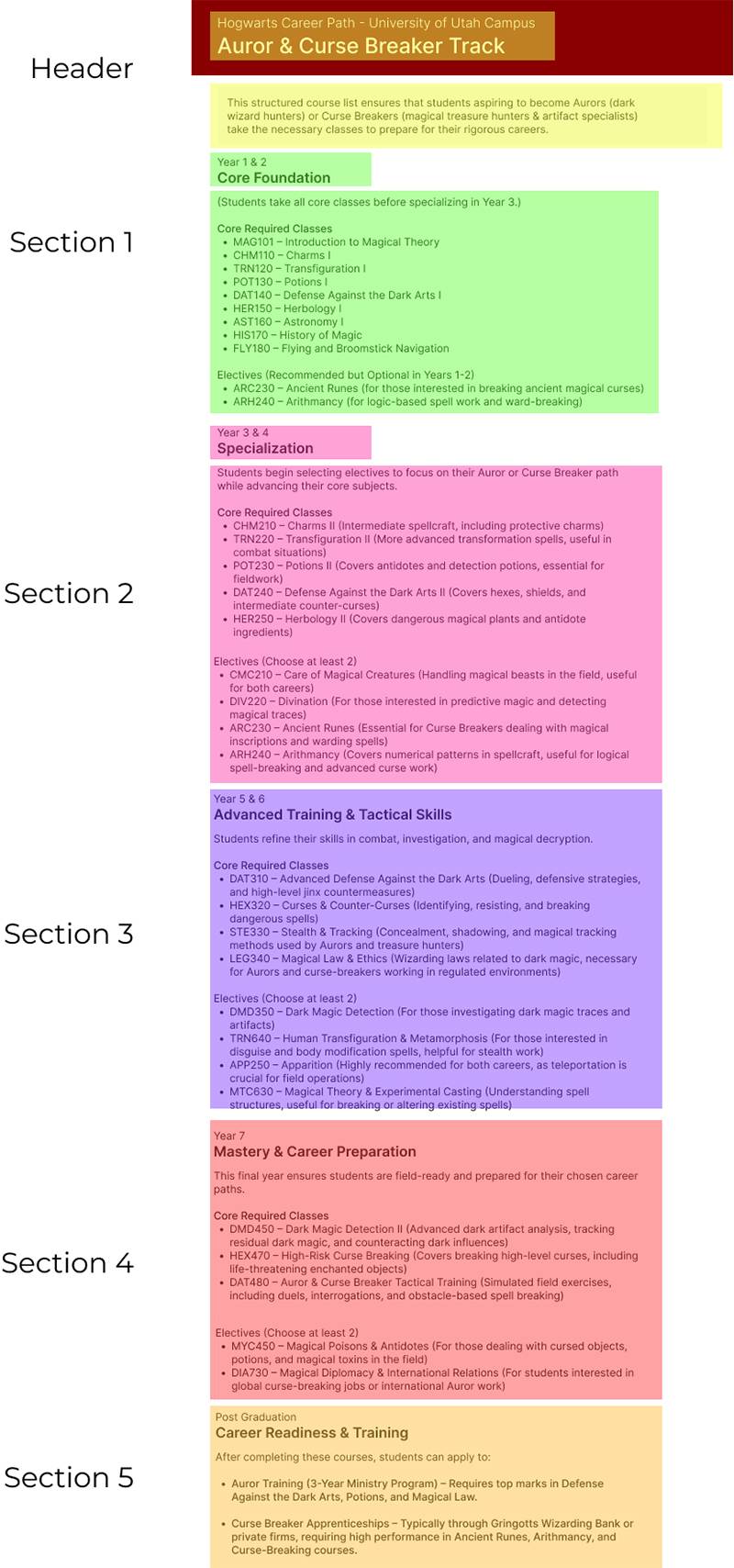
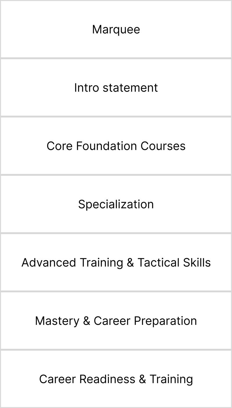
Planning is where you begin structuring content and planning what information will appear on the page. (See Figure 1.1)
1. Content Strategy
- New Designs: Analyze the content you have and determine how best to present it. Highlight key information and categorize content to improve readability.
- Redesigns: Audit the content on the existing page. What should be retained, removed, or reorganized? Some information may be placed elsewhere on the site.
2. Structuring the Page
 Regardless of whether you are designing a new page or redesigning an existing one,
organizing content logically helps in planning the final layout. (See Figure 1.2)
Regardless of whether you are designing a new page or redesigning an existing one,
organizing content logically helps in planning the final layout. (See Figure 1.2)
- Identify key sections and arrange content in a way that enhances clarity and flow.
- Consider how users navigate the page and ensure information is presented in a logical order.
- Use content hierarchies, headings, and sections to create a coherent structure that improves user experience.
Gathering inspiration from similar sites or industry standards can help determine effective layouts and features that enhance usability.
Phase 3: Design
 With a solid plan in place, it’s time to bring your design ideas to life.
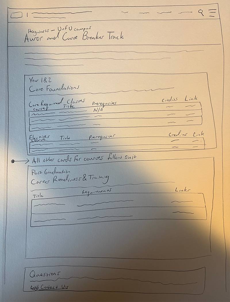
1. Low-Fidelity Sketching
- Sketching allows you to experiment with layout ideas before committing to a final design.
- Keep sketches simple—focus on structure, not artistic details. (See Figure 1.3)
- This stage is ideal for gathering feedback from stakeholders before refining the design further.
2. High-Fidelity Design
Once sketches are finalized, you can create a polished, high-fidelity design.
- For new pages, this means translating your plan into a fully fleshed-out design.
- For redesigns, incorporate feedback and insights from the previous phases to create a visually improved, more functional version of the existing page.
By following this structured approach, whether starting fresh or refining an existing design, you can confidently create web pages that are clear, effective, and user-friendly.
Q & A
Q: How do you approach a situation where an individual may be asking for too much (either the task falls out of scope, or they're wanting more content than is needed)?
A: It is always a good idea to set expectations and limitations for projects from the beginning. Using the design phases discussed above, you can review the new information to determine which will be useful or if a specific design suggested will work within the template. Using the scholarship example during the forum, the “Scholarship Eligibility & Requirements” section was removed entirely since they are dependent on the scholarship with the design kept simple to not overload users.
Q: What would you suggest to a department/program that is routinely asking to remove a page from their site, only to then re-add it a short time later?
A: Departments/programs may feel that taking down a page (say for a registration), when it is unavailable will help reduce confusion for users. In some instances, this may be the best option but most of the time it is better to leave the page up with some sort of note that while something may be unavailable at that time, it will be available again at a later date.
Let’s use the example of a scholarship only available in Spring semester. By keeping up the page year-round, and adding a notice of the specific application period, search engines will still be able to show the information to prospective applicants who will know when to sign up. If the page is removed entirely, prospective applicants will not be able to find that scholarship and may cause them to look elsewhere and/or believe that the scholarship is no longer available.
Q: How do you keep consistency across a site?
A: Something new that our team has been doing is creating a Style/Design Guide for our redesign projects. We determine what goes into these guides during our planning phases to determine general layouts for different types of pages (landing, directory subpages, etc.) to help with consistency and usability. We also determine the styling for specific elements on pages such as headings, icons, cards, etc. Even if you are only able to do one page at a time, creating a guide can be a great resource for maintaining consistency.
Q: What are the benefits and drawbacks of hidden content (pop-ups, accordions, and flashcards)?
A: From a design perspective, hide-able content provides many benefits by making a page simple, but provides a viewer clickable action items if they want more information.
From an accessibility and SEO perspective, the hidden information may pop up in a Google search but will be hidden when the user tries to locate the information on the page. We recommend using pop-ups, accordions, and flashcards only when the content is supplementary to what’s readily/visually available.
Q: How can you justify a certain design decision to stakeholders?
A: If specific content does not meet the page’s goal, it should be removed or relocated to a better page. If you have taken into consideration the page’s goal, your target audience, this move is what will be best for your audience. One thing to remember is that your site is not for you, it is for your audience. Something that might have been interesting or fun to include initially, may not serve the same purpose now.
Q: How do you present large amounts of information so that it is digestible?
A: Ultimately, this is something that takes practice. But there are steps that you can take to make this task easier while you are getting the hang of it.
Step 1 - Identifying information and testing is absolutely necessary. Most pages with heavy
amounts of information are inflated with supporting information that isn't needed.
Using a tool like an AI Chatbot can help to summarize or condense the information.
Step 2 - Group the information in categories to see if it can be further sectioned off.
Step 3 - Gather some examples to find inspiration on what others have done to present similar
information.
Step 4 - Sketch it out.
Step 5 - Design it/Build it.
It's all about simplifying the information for your user. Remember, more often than not, less is more.
Q: When would a database be better than manually updating the page?
A: Databases are great for when you have a lot of data items to display and you want the ability to filter the data in some way. If you only have a handful of data items to display and it is easy to view them all on one page you probably don't need a database.
Wrap up
Designing or redesigning a webpage doesn’t have to be an overwhelming process. By following a structured approach—starting with discovery, moving through planning, and refining designs in stages—you can create a well-thought-out, user-friendly webpage that meets both business and user needs.
If you have any further questions or suggestions, feel free to reach out to the UIT Web Support & Usability team.
Happy designing!