Image Accessibility
Bits & Bytes Recap
Welcome to this month’s Bits & Bytes! This month, we took a closer look at image accessibility, focusing on how to make web content more inclusive by using alternative text, more commonly referred to as "alt text." Whether you're a developer, content editor, or digital designer, understanding how to write meaningful alt text can significantly improve the user experience for people who rely on screen readers.
What is Alt Text and Why Does it Matter?
Alt text is a short description that stands in for an image when it can’t be seen. It’s a crucial tool for screen readers, which read the alt text aloud to users who use accessibility tools. It also serves as a fallback when images fail to load and provides additional context for search engines.
The goal of alt text is to convey the content and function of an image. It should be accurate and succinct, focusing on what’s essential without repeating details already stated in the surrounding text. For instance, it’s unnecessary to start alt text with phrases like “image of” or “graphic of,” since screen readers already indicate to their users that there is an image.
There are times when an image isn’t meant to convey new information—it may just support the page’s layout or aesthetics. In those cases, it's best to mark the image as decorative. This tells screen readers to skip over the image, helping users focus on the meaningful content.
A Look at the Numbers
The WebAIM 2025 report, which reviewed and analyzed the accessibility of over 1 million home pages and more than 58 million images, found that 13.4% had text that was either repetitive or questionable in quality, and 18.5% of images lacked alt text altogether. Even more striking, 44% of images were linked, but many of those failed to explain where the link would take the user.
These numbers reveal a widespread issue: nearly one third of images on popular websites have alt text that is insufficient or missing. Fixing these problems is not just a compliance exercise—it’s an opportunity to make the web more inclusive for everyone.
Real-World Examples: What Makes Good Alt Text?
To better understand what makes alt text effective, let’s consider a few examples.
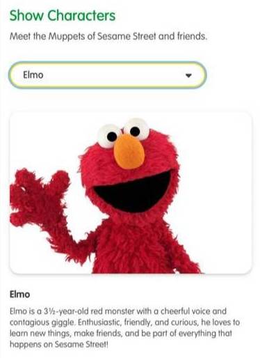
Elmo scenario example
In one scenario, we see an image of Elmo, the red puppet with an orange nose, smiling and waving. If this image is simply added to a paragraph already describing Elmo, then the best course of action would be to mark the image as decorative. Including alt text in this case would just repeat what's already been said, potentially distracting screen reader users rather than helping them.
In another example, there is an image of Ellen Ochoa, the first Hispanic woman to travel to space. Her astronaut attire in the image reinforces her role and accomplishments. While the surrounding text provides some context, her visual presentation adds additional meaning. In this case, appropriate alt text such as “Ellen Ochoa, the first Hispanic woman to travel to space” would add to the existing content.

Ellen Ochoa scenario example
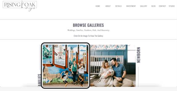
Rising Oak's scenario example
The final example we used was the Rising Oak Family Gallery webpage, where an image shows two children running with parents nearby, and one parent holding a baby. At first glance, this image could be argued as either essential or decorative but, since this image links to a family photo gallery, it's not just decorative—it’s functional. The alt text must tell users where the link goes. Something like “Family Gallery for Rising Oak” indicates what users can expect if they follow the link.
Best Practices
Writing strong alt text takes practice, but a few guiding principles can help. Start by ensuring the alt text captures what’s essential in the image—especially anything not covered elsewhere on the page. Avoid technical jargon or abbreviations unless they’re well-known by your audience. If the image includes visible text that’s meaningful, include that in your alt text too.
Avoid duplicating alt text across multiple images, even if they look similar. Each image should be treated individually based on its context. If the identity of a person or place is important to understanding and relevant to the content. It’s also good practice to end alt text with a period, as this can improve how screen readers pause and deliver the information.
Another helpful tip is to front-load your alt text with the most important information. Screen reader users may navigate quickly through content, so giving them the key detail right away can improve comprehension and efficiency.
When you're not sure if an image needs alt text, ask yourself these three questions:
- Is it Referential? Does the image add new, useful information?
- Is it Repetitive? Is the image already described clearly nearby?
- Is it Efficient? Will alt text help users understand or complete a task?
If your answer is yes to the majority of these questions, you should add alt text. If not, it might be best to mark the image as decorative.
Q & A
Q: If I have a photo gallery on my page, is it better to mark all the images as decorative or come up with unique alt text for each image?
A: There are two different approaches with this question - the Letter of the Law vs. Spirit of the Law.
The Letter of the Law approach emphasizes that any image conveying important content or supporting a task should have alt text. So, if your gallery images provide meaningful information relevant to the page—such as showing services, people, or events—they should each have unique, descriptive alt text.
The Spirit of the Law considers the broader user experience. If the same information conveyed by the images is already clearly available elsewhere on the page—for example, in captions or surrounding text—then it may be acceptable to mark those images as decorative, especially if they don’t add new or critical information.
Whichever approach you choose, the key is that all users—whether or not they rely on screen readers—should have access to the same essential information and context.
Q: What do I need to do to make my linked image accessible?
A: When an image is linked instead of text, the alt text for that image should be the destination of the link. To do this, select your image and then click the link icon in the WYSIWYG toolbar. Input your link and leave the link title blank. Once published, verify the alt text is the link destination and you’ll be good to go!
Wrap-Up
Alt text isn’t just a checkbox—it’s a vital part of making your content accessible
and meaningful. It ensures that all users, including those using screen readers, can
understand and engage with your visual content.
To sum up, good alt text should clearly reflect the image’s content and purpose. Decorative
images should be marked as such, and for linked images, the alt text should indicate
where the link leads to help users navigate with confidence.
Happy Designing!
About the Blog
University of Utah's discussion channel for insightful chat about events, news, and activities.