Modern Campus CMS Guides: Helper Classes
What are helper classes?
Helper classes are additional styling elements that can be added to snippets and page elements. Below is a complete list of helper classes, categorized under their corresponding snippet in alphabetical order.
Where are helper classes added?
Unless otherwise noted, helper classes are added in the following locations:
Classes marked with an * are found in the styles dropdown in the WYSIWYG toolbar.
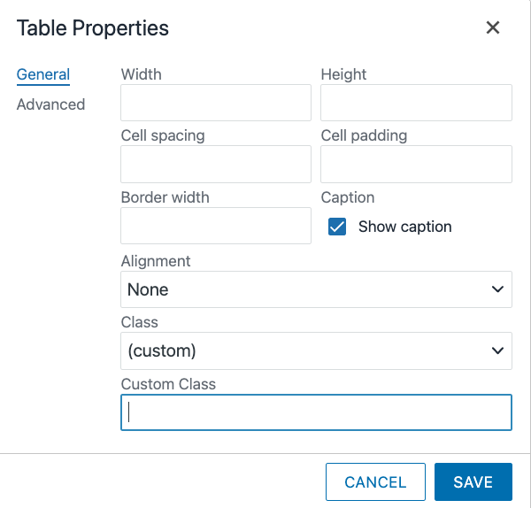
Table Properties
Step 1:
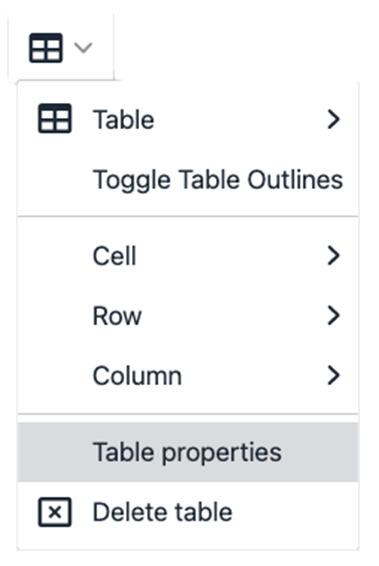
Click the Table Properties Tool in the Quick Links Menu.
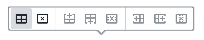
Alternately, click the Table Properties Tool in the WYSIWYG Toolbar.
Step 2:
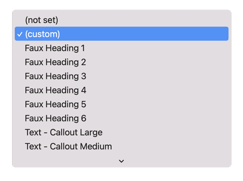
With the Table Properties Dialog Box open, switch the Class dropdown to (custom).
Step 3:
Type the helper class(es) in the Custom Class textbox. Separate multiple classes with spaces.
Body Class - Page Parameters
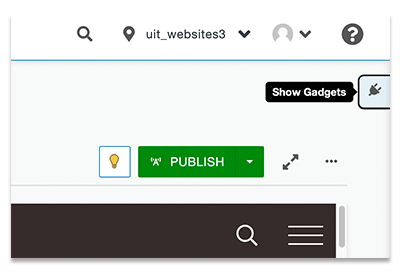
Step 1:
Navigate to Gadgets.
Step 2:
With the Gadgets sidebar open, select the Page Parameters dropdown.
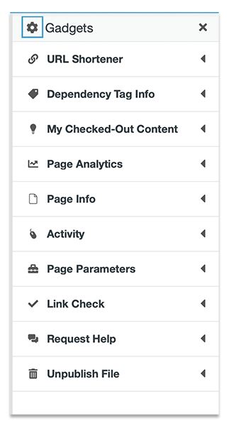 Not seeing the Page Parameters dropdown? Review your gadgets by clicking the gear
icon.
Not seeing the Page Parameters dropdown? Review your gadgets by clicking the gear
icon.
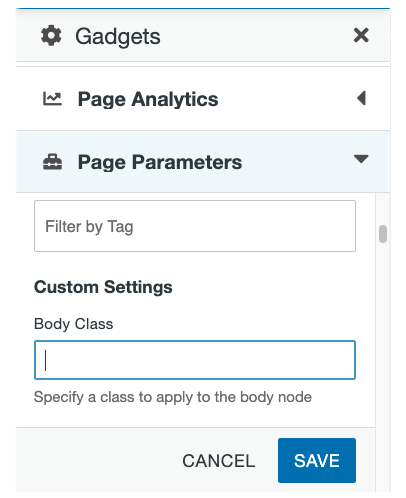
Step 3:
Once the Page Parameters dropdown is open, scroll to the Custom Settings Section and locate the Body Class text field. Type the helper class(es) here and separate multiple classes with spaces.
Link Properties
Step 1:
Click the Insert/Edit Link Tool in WYSIWYG Toolbar.

Step 2:
With the Link Properties Dialog Box open, switch the Class dropdown to (custom).
Step 3:
Type the helper class(es) in the Custom Class textbox. Separate multiple classes with spaces.
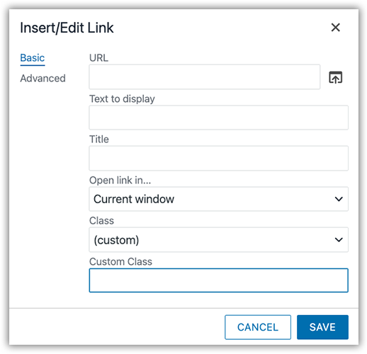
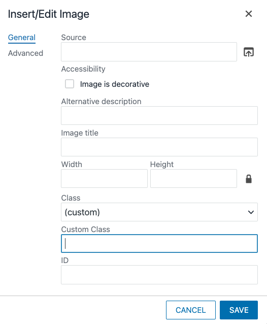
Image Properties
Step 1:
Click the Insert/Edit Image Tool in WYSIWYG Toolbar.

Step 2:
With the Image Properties Dialog Box open, switch the Class dropdown to (custom).
Step 3:
Type the helper class(es) in the Custom Class textbox. Separate multiple classes with spaces.
Styles Dropdown
Step 1:
Click the Styles dropdown in WYSIWYG Toolbar.
Step 2:
Select one or more of the styles in the Styles dropdown.
The helper classes list
A
Accordion
These classes are added in the table properties.
| Class Name | Description |
|---|---|
| has-border | Table property class to add border around accordion items. |
| hvr-dark-gray | Adds a dark gray hover and selected state to accordion items. |
| hvr-u-red | Adds a red hover and selected state to accordion items. |
| u-red | Option to add u-red background color to accordion toggle items. |
| dark-gray | Option to add dark gray background color to accordion toggle items |
| has-panel-border | Adds border to accordion drop-down panels |
| body-font | Makes the accordion toggle text match the default body font. |
| heading-x | Table property class to change the accordion item heading level. By default the accordion item headings are h3 headings. Replace the x in the class with a heading level 1 to 6. |
| Icons: Font Awesome classes with an underscore between the first and second class names. | Add a slightly modified Font Awesome class to the table cell properties. Example: if the Font Awesome class is "fal fa-air-freshener", the class added to the table cell property would be "fal_fa-air-freshener". Replace the space in the class name with an underscore character. |
B
Back-To-Top Link
These classes are added in the body class under page parameters.
| Class Name | Description |
|---|---|
| no-top-link | Hides the back-to-top link. |
Blog
These classes are added in the body class under page parameters.
| Class Name | Description |
|---|---|
| share-float | Turns on the floating shared icon for the page. |
| no-post-social | Turns off the static shared icon for the blog post page (often used in conjunction with the shared-float class which turns on the floating share social icons). |
Breadcrumb
These classes are added in the body class under page parameters.
| Class Name | Description |
|---|---|
| no-breadcrumb | Turn off the breadcrumb navigation |
| no-breadcrumb-item3 | Remove third item in the breadcrumb list (used primarily for blog pages to remove redundant Post folder). |
| no-breadcrumb-item4 | Remove fourth item in the breadcrumb list (used primarily for blog pages to remove redundant Post folder). |
Buttons
These classes are added in the link properties.
| Class Name | Description |
|---|---|
| uu-btn | Base class for all buttons. This is the default red color |
| white | White button |
| text-dark | Used with white button to make the text dark gray |
| light-gray | Light gray button |
| medium-gray | Medium gray button |
| dark-gray | Dark gray button |
| ghost | Ghost (transparent) button -- used over dark background areas |
| small | Small button |
| large | Large button |
| xlarge | Xtra large button |
| block | Block button -- fills the parent container width |
| arrow-r | Add arrow icon to the right side of the button |
| arrow-l | Add arrow icon to the left side of the button |
| text-left | Align the text on the button to the left |
| text-right | Align the text on the button to the right |
C
Carousel
These classes are added in the table properties.
| Class Name | Description |
|---|---|
| ext-btns | Position buttons outside of the carousel content |
| autoplay | Sets the carousel to automatically rotate through the slides. |
| controls-bottom-right | Position the pause/play controls at the bottom right side of the carousel. |
Columns - Custom Width
These classes can be added to the snippet table properties or individual table cell properties.
| Class Name | Description |
|---|---|
| stretch | Stretch the columns so they fill the available horizontal space. |
| full-width | Make the columns fill the window width. |
| full-height | Make the columns fill the height of its containing element. |
| no-side-margins | Remove side margins. |
| no-bottom-margin | Remove bottom margin. |
| no-gutters | Remove space between items. |
| padding-default | Item has default padding. |
| padding-only | Remove border but keep padding. |
| padding-sm | Add small padding to items. |
| padding-md | Add medium padding to items. |
| padding-lg | Add large padding to items. |
| has-border | Show column borders. |
| no-border | Remove border and padding of item (apply only to table cell). |
| border-sm | Makes the border thinner than the default. |
| border-lg | Makes the border thicker than the default. |
| border-radius-sm | Makes the box corner radius small. |
| border-radius-md | Makes the box corner radius medium. |
| border-radius-lg | Makes the box corner radius large. |
| ghost-border | Make the border transparent but keep the column padding. |
| column-rule | Applied to columns without borders to apply a vertical rule line be columns on larger screens. |
| remove-overflow-border | Removes the column border but keeps the padding. Used primarily in conjunction with overflow images. |
| remove-bottom-margin | Removes the bottom margin in each cell. |
| border-shadow | Adds a drop-shadow behind each column. |
| hover-shadow | Adds a drop-shadow when the column is hovered over. |
| hover-link | Gives the column a hover state. Best when used in columns containing only one link. The column link URL is set from the first link in the column. |
| pin-bottom | Pin the last item in each column to the bottom center of the column. |
| pin-left | Used in conjunction with pin-bottom class to pin the last item in each column to the bottom left. |
| pin-right | Used in conjunction with pin-bottom class to pin the last item in each column to the bottom right. |
| filter-light | Makes each column have a light translucent background. |
| filter-dark | Makes each column have a dark translucent background. |
| center-content | Vertically and horizontally center content in columns. |
| align-left | Used in conjunction with the "center-content" helper class to center content vertically while aligning content to the left. |
| align-right | Used in conjunction with the "center-content" helper class to center content vertically while aligning content to the right. |
| offset-top-sm | Create a small offset to move item up. This class is intended to allow items to straddle section borders. |
| offset-top-md | Create a medium offset to move item up. This class is intended to allow items to straddle section borders. |
| offset-top-lg | Create a large offset to move item up. This class is intended to allow items to straddle section borders. |
| offset-bottom-sm | Create a small offset to move item down. This class is intended to allow items to straddle section borders. |
| offset-bottom-md | Create a medium offset to move item down. This class is intended to allow items to straddle section borders. |
| offset-bottom-lg | Create a large offset to move item down. This class is intended to allow items to straddle section borders. |
| uu-tab-row | Removes margin spacing between cell items to create a row of tabs. Best when used on a grid with one row. |
| wrap-left | Cells that don't fit on one line will be wrapped and begin stacking from the left. |
| wrap-right | Cells that don't fit on one line will be wrapped and begin stacking from the right. |
| white | Add white background color to all columns. |
| light-gray | Add light gray background color to all columns. |
| medium-gray | Add medium gray background color to all columns. |
| dark-gray | Add dark gray background color to all columns. |
| u-red | Add u red background color to all columns. |
| wasatch-sunrise | Secondary color (yellow). |
| great-salt-lake | Secondary color (teal). |
| red-rocks | Secondary color (dark red). |
| granite-peak | Secondary color (dark blue-gray). |
| salt-flat-gray | Secondary color (light gray). |
| digital-gray | Secondary color (extra light gray). |
| mountain-green | Secondary color (green). |
| zion-cinder-cone | Secondary color (dark gray) |
G
Grid Filter
These classes are added in the table properties.
| Class Name | Description |
|---|---|
| has-border | Show grid borders. |
| border-sm | Makes the border thinner than the default. |
| border-lg | Makes the border thicker than the default. |
| padding-only | Remove border but keep cell padding. |
| ghost-border | Make the border transparent but keep the cell padding. |
| remove-overflow-border | Removes the cell border but keeps the padding. Used primarily in conjunction with overflow images. |
| border-shadow | Adds a drop-shadow behind each grid cell. |
| border-radius-sm | Makes the box corner radius small. |
| border-radius-md | Makes the box corner radius medium. |
| border-radius-lg | Makes the box corner radius large. |
| hover-shadow | Adds a drop-shadow to each grid cell when it's hovered over. |
| hover-link | Gives each grid cell a hover state. Best when used in cell containing only one link. The cell link URL is set from the first link in the cell. |
| white | Add white background color to all grid cells. |
| light-gray | Add light gray background color to all grid cells. |
| medium-gray | Add medium gray background color to all grid cells. |
| dark-gray | Add dark gray background color to all grid cells. |
| u-red | Add u red background color to all grid cells. |
| wasatch-sunrise | Secondary color (yellow). |
| great-salt-lake | Secondary color (teal). |
| red-rocks | Secondary color (dark red). |
| granite-peak | Secondary color (dark blue-gray). |
| salt-flat-gray | Secondary color (light gray). |
| digital-gray | Secondary color (extra light gray). |
| mountain-green | Secondary color (green). |
| zion-cinder-cone | Secondary color (dark gray) |
| pin-bottom | Pin the last item to the bottom center of the cell. |
| pin-left | Used in conjunction with pin-bottom class to pin the last item in each cell to the bottom left. |
| pin-right | Used in conjunction with pin-bottom class to pin the last item in each cell to the bottom right. |
| filter-light | The grid cells will have a light translucent background. |
| filter-dark | The grid cells will have a dark translucent background. |
| center-content | Vertically and horizontally center content in grid cells. |
| align-left | Used in conjunction with the "center-content" helper class to center content vertically while aligning content to the left. |
| align-right | Used in conjunction with the "center-content" helper class to center content vertically while aligning content to the right. |
Grid Filter - Checkboxes
These classes are added in the table properties.
| Class Name | Description |
|---|---|
| control-btns | Turns on the “select all” and “deselect all” buttons for the grid filter. |
Grid Layout
These classes can be added to the snippet table properties or individual table cell properties.
| Class Name | Description |
|---|---|
| stretch | Stretch the cells so they fill the available horizontal space when wrapping. |
| full-width | Makes the grid fill the screen width. |
| full-height | Makes grid fill the height of its containing element. |
| has-border | Show grid borders. |
| no-border | Remove border and padding of item (apply only to table cell). |
| border-sm | Makes the border thiner than the default. |
| border-lg | Makes the border thicker than the default. |
| border-radius-sm | Makes the box corner radius small. |
| border-radius-md | Makes the box corner radius medium. |
| border-radius-lg | Makes the box corner radius large. |
| no-side-margins | Remove side margins. |
| no-bottom-margin | Remove bottom margin. |
| no-gutters | Remove space between items. |
| padding-default | Item has default padding. |
| padding-only | Remove border but keep padding. |
| padding-sm | Add small padding to items. |
| padding-md | Add medium padding to items. |
| padding-lg | Add large padding to items. |
| ghost-border | Make the border transparent but keep the cell padding. |
| remove-overflow-border | Removes the cell border but keeps the padding. Used primarily in conjunction with overflow images. |
| feature-grid | Used on grids with a top feature image in each cell where the image will fill the area width. Also, use if an image is to be placed on the right or left of the cell with content floated to the side. |
| remove-bottom-margin | Removes the bottom margin in each cell. |
| border-shadow | Adds a drop-shadow behind each grid cell. |
| hover-shadow | Adds a drop-shadow to each grid cell when it's hovered over. |
| hover-link | Gives each grid cell a hover state. Best when used in cell containing only one link. The cell link URL is set from the first link in the cell. |
| pin-bottom | Pin the last item to the bottom center of the cell. |
| pin-left | Used in conjunction with pin-bottom class to pin the last item in each cell to the bottom left. |
| pin-right | Used in conjunction with pin-bottom class to pin the last item in each cell to the bottom right. |
| filter-light | The grid cells will have a light translucent background. |
| filter-dark | The grid cells will have a dark translucent background. |
| center-content | Vertically and horizontally center content in grid cells. |
| align-left | Used in conjunction with the "center-content" helper class to center content vertically while aligning content to the left. |
| align-right | Used in conjunction with the "center-content" helper class to center content vertically while aligning content to the right. |
| offset-top-sm | Create a small top offset to move item up. This class is intended to allow items to straddle section borders. |
| offset-top-md | Create a medium offset to move item up. This class is intended to allow items to straddle section borders. |
| offset-top-lg | Create a large offset to move item up. This class is intended to allow items to straddle section borders. |
| offset-bottom-sm | Create a small offset to move item down. This class is intended to allow items to straddle section borders. |
| offset-bottom-md | Create a medium offset to move item down. This class is intended to allow items to straddle section borders. |
| offset-bottom-lg | Create a large offset to move item down. This class is intended to allow items to straddle section borders. |
| uu-tab-row | Removes margin spacing between cell items to create a row of tabs. Best when used on a grid with one row. |
| wrap-left | Cells that don't fit on one line will be wrapped and begin stacking from the left. |
| wrap-right | Cells that don't fit on one line will be wrapped and begin stacking from the right. |
| eq-height-cells | Makes all the cells in the grid (or multiple grids on same page) the same height. |
| white | Add white background color to all grid cells. |
| light-gray | Add light gray background color to all grid cells. |
| medium-gray | Add medium gray background color to all grid cells. |
| dark-gray | Add dark gray background color to all grid cells. |
| u-red | Add u red background color to all grid cells. |
| wasatch-sunrise | Secondary color (yellow). |
| great-salt-lake | Secondary color (teal). |
| red-rocks | Secondary color (dark red). |
| granite-peak | Secondary color (dark blue-gray). |
| salt-flat-gray | Secondary color (light gray). |
| digital-gray | Secondary color (extra light gray). |
| mountain-green | Secondary color (green). |
| zion-cinder-cone | Secondary color (dark gray) |
H
Horizontal Line (rule)
These classes are added to a horizontal line using the styles dropdown.
| Class Name | Description |
|---|---|
| * hr-u-red | Red full width horizontal line. |
| * hr-u-red-sm | Red small width horizontal line. |
| * hr-u-red-md | Red medium width horizontal line. |
| * hr-u-red-lg | Red large width horizontal line. |
| * hr-light-gray | Light gray full width horizontal line. |
| * hr-light-gray-sm | Light gray small width horizontal line. |
| * hr-light-gray-md | Light gray medium width horizontal line. |
| * hr-light-gray-lg | Light gray large width horizontal line. |
| * hr-medium-gray | Medium Gray full width horizontal line. |
| * hr-medium-gray-sm | Medium Gray small width horizontal line. |
| * hr-medium-gray-md | Medium Gray medium width horizontal line. |
| * hr-medium-gray-lg | Medium Gray large width horizontal line. |
| * hr-dark-gray | Dark Gray full width horizontal line. |
| * hr-dark-gray-sm | Dark Gray small width horizontal line. |
| * hr-dark-gray-md | Dark Gray medium width horizontal line. |
| * hr-dark-gray-lg | Dark Gray large width horizontal line. |
I
Images
These classes are added in the image properties.
| Class Name | Description |
|---|---|
| * img-rounded | Add rounded corners to image |
| * img-circle | Makes the image a circle (if the height and width are the same) |
| * img-thumbnail | Add rounded corners and border to image |
| * img-float-right | Float image right |
| img-float-right-sm | Float image right on small screens |
| img-float-right-md | Float image right on medium screens |
| img-float-right-lg | Float image right on large screens |
| * img-float-left | Float image left |
| img-float-left-sm | Float image left on small screens |
| img-float-left-md | Float image left on medium screens |
| img-float-left-lg | Float image left on large screens |
| * img-center | Center image |
| img-center-sm | Center image on small screens |
| img-center-md | Center image on medium screens |
| img-center-lg | Center image on large screens |
| * img-full-width | Make the image fill the horizontal space. |
| img-cover | Make image cover it's container. |
| img-full-width-sm | Make the image fill the horizontal space on small screens. |
| img-full-width-md | Make the image fill the horizontal space on medium screens. |
| img-full-width-lg | Make the image fill the horizontal space on large screens. |
| img-overflow-sides | Image will overflow the content area into the horizontal padding (used on images within panels and regions). |
| img-overflow-top | Image will overflow the content area into the top padding (used on images within panels and regions). |
| img-overflow-bottom | Image will overflow the content area into the bottom padding (used on images within panels and regions). |
| img-shadow-sm | Adds small shadow to image. |
| img-shadow-md | Adds medium shadow to image. |
| img-shadow-lg | Adds large shadow to image. |
| img-border-sm | Adds small border to image. |
| img-border-md | Adds medium border to image. |
| img-border-lg | Adds medium border to image. |
Images (linked)
These classes are added in the link properties.
| Class Name | Description |
|---|---|
| hvr-grow | Link class for grow hover effect |
| hvr-fade | Link class for fade hover effect |
Image with Caption
These classes are added in the table properties.
| Class Name | Description |
|---|---|
| has-border | Adds border around image and caption. |
| width-quarter | Limit the image and caption area width to one quarter of the available space. |
| width-third | Limit the image and caption area width to one third of the available space. |
| width-half | Limit the image and caption area width to one half of the available space. |
| position-left | Float the image and caption area to the left. Often used in conjunction with the width limiting classes. |
| position-center | Center the image and caption area. Often used in conjunction with the width limiting classes. |
| position-right | Float the image and caption area to the right. Often used in conjunction with the width limiting classes. |
Image Gallery
These classes are added in the link properties.
| Class Name | Description |
|---|---|
| u-gallery-xxx | Each unique gallery class will create a new gallery. The link title attribute becomes the caption for the gallery item. The URL property links to the larger gallery image. |
Image Overlay
These classes are added in the table properties.
| Class Name | Description |
|---|---|
| filter-dark | Adds dark shade to image overlay. |
| has-border |
Adds a border around the image overlay. |
| full-height |
Makes image overlay item fill the height of it's container. |
| static-caption |
Remove caption hover animation and overlay text on bottom of image. |
L
Links
These classes are added in the link properties.
| Class Name | Description |
|---|---|
| link-no-underline | Removes default underline from linked text. |
| link-hvr-underline | Adds the underline to linked text hover state. |
Lists
These classes are added to the list tag in the source code. You can also use the v3-Number List snippet.
| Class Name | Description |
|---|---|
| number-list | Class added to the ordered list to create list with large styled numbers. This can also be implemented using the v3-Number List snippet. |
M
Main Navigation Icons
These classes are added to the list tag in the source code.
| Class Name | Description |
|---|---|
| Icons: Font Awesome classes with an underscore between the first and second class names. |
Top level menu items can have icons. Add a slightly modified Font Awesome class to the link anchor tag properties. Example: if the Font Awesome class is "fal fa-air-freshener", the class added to the table cell property would be "fal_fa-air-freshener". Replace the space in the class name with an underscore character. |
Margins - Custom
These classes are added to elements in the styles dropdown.
| Class Name | Description |
|---|---|
| margin-top-0x | Removes top margin. |
| margin-top-halfx | Adds one half character space margin to the top. |
| * margin-top-1x | Adds one character space margin to the top. |
| * margin-top-2x | Adds two character space margin to the top. |
| * margin-top-3x | Adds three character space margin to the top. |
| margin-bottom-0x | Removes bottom margin. |
| margin-bottom-halfx | Adds one half character space margin to the bottom. |
| * margin-bottom-1x | Adds one character space margin to the bottom. |
| * margin-bottom-2x | Adds two character space margin to the bottom. |
| * margin-bottom-3x | Adds three character space margin to the bottom. |
| * margin-left-1x | Adds one character space margin to the left. |
| * margin-left-2x | Adds two character space margin to the left. |
| * margin-left-3x | Adds three character space margin to the left. |
| * margin-right-1x | Adds one character space margin to the right. |
| * margin-right-2x | Adds two character space margin to the right. |
| * margin-right-3x | Adds three character space margin to the right. |
Marquee
These classes are added in the body class under page parameters.
| Class Name | Description |
|---|---|
| marquee-bg-left | Aligns marquee background image to the left. |
| marquee-bg-right | Aligns marquee background image to the right. |
| marquee-bg-top | Aligns marquee background image to the top. |
| marquee-bg-bottom | Aligns marquee background image to the bottom. |
| marquee-bg-fixed | Set background image to fixed position. |
| marquee-bg-white | Set marquee background color to white and caption text to default dark color. |
| marquee-contain | Makes the entire default marquee image visible within the marquee area. |
| marquee-no-shade | Turn off the marquee shade behind the caption area |
| marquee-hide-default | Used in conjunction with marquee videos to hide the default background image. |
Modal
These classes are added in the table properties.
| Class Name | Description |
|---|---|
| modal-xxx | (default is "modal-name"). If there is more than one modal pop-up on a page, they each need to have a unique modal name in the properties (xxx portion of class is replace by custom name). |
Modal Links
These classes are added in the link properties.
| Class Name | Description |
|---|---|
| modal-link | Class added to the modal link item property. |
| #modal-xxx | Modal link URL points to a unique modal name set in the modal snippet table property. |
P
Panel
These classes are added in the table properties.
| Class Name | Description |
|---|---|
| full-height | Makes the panel fill the height of the containing element. |
| full-width | Makes the panel fill the window width. |
| no-side-margins | Remove the panel side margins. |
| no-bottom-margin | Remove the panel bottom margin. |
| padding-only | Removes the border but keeps the cell padding. |
| padding-sm | Small cell padding. |
| padding-md | Medium cell padding. |
| padding-lg | Large cell padding. |
| pin-bottom | Pin the last item in the panel to the bottom. This can also be applied as a section class to pin the last item in each region. |
| pin-left | Used in conjunction with pin-bottom class to pin the last item to the bottom left of the panel. This can also be applied as a section class to pin the last item in each region. |
| pin-right | Used in conjunction with pin-bottom class to pin the last item to the bottom right of the panel. This can also be applied as a section class to pin the last item in each region. |
| width-quarter | Limit the panel width to one-quarter of the available space. |
| width-third | Limit the panel width to one-third of the available space. |
| width-half | Limit the panel width to one-half of the available space. |
| width-two-thirds | Limit the panel width to two-thirds of the available space. |
| width-three-quarters | Limit the panel width to three-quarters of the available space. |
| position-left |
Float the panel to the left. Used in conjunction with one of the classed to limit the panel width. |
| position-center | Center the panel in the available space. Used in conjunction with one of the classed to limit the panel width. |
| position-right | Float the panel to the right. Used in conjunction with one of the classes to limit the panel width. |
| center-content | Vertically and horizontally center content in panel. |
| align-left | Used in conjunction with the "center-content" helper class to center content vertically while aligning content to the left. |
| align-right | Used in conjunction with the "center-content" helper class to center content vertically while aligning content to the right. |
| no-border | Removes the panel border and padding. |
| border-sm | Makes the border thiner than the default. |
| border-lg | Makes the border thicker than the default. |
| border-radius-sm | Makes the box corner radius medium. |
| border-radius-md | Makes the box corner radius large. |
| border-radius-lg | Changes the border color to dark gray. |
| ghost-border | Make the border transparent but keep the panel padding. |
| bg-contain | Make the entire background image fit within the panel area. |
| bg-fixed | Set the background image position to fixed. This prevents the image from moving as the window is scrolled. |
| bg-left | Align the background image to the left. |
| bg-right | Align the background image to the right. |
| bg-top | Align the background image to the top. |
| bg-bottom | Align the background image to the bottom. |
| hover-link | Gives the panel a hover state. Best when used in panel containing only one link. The panel link URL is set from the first link in the panel. |
| remove-overflow-border | Removes the panel border but keeps the padding. Used primarily in conjunction with overflow images. |
| border-shadow | Adds a drop-shadow behind the panel. |
| hover-shadow | Adds a drop-shadow when the panel is hovered over. |
| thumbnail-sm | Small thumbnail format with image on the left. Used in conjunction with the hover-link class. |
| thumbnail-md | Medium thumbnail format with image on the left. Used in conjunction with the hover-link class. |
| thumbnail-lg | Large thumbnail format with image on the left. Used in conjunction with the hover-link class. |
| single-line | Used if there is one line of text and it needs to be vertically centered. Used in conjunction with the hover-link class. |
| extend-width | Extends the panel width to fill the screen. |
| top-stack | To be used only on a panel snippet with the extend-width class, and only if the panel is the first item in a section. If used correctly, this helper class will shift the panel up to cover the section top margin. |
| bottom-stack | To be used only on a panel snippet with the extend-width class, and only if the panel is the last item in a section. If used correctly, this helper class will shift the panel down to cover the section bottom margin. |
| min-height-300 | Set the minimum height of the panel to 300 pixels. |
| min-height-500 | Set the minimum height of the panel to 500 pixels. |
| min-height-700 | Set the minimum height of the panel to 700 pixels. |
| offset-top-sm | Create a small offset to move item up. This class is intended to allow items to straddle section borders. |
| offset-top-md | Create a medium offset to move item up. This class is intended to allow items to straddle section borders. |
| offset-top-lg | Create a large offset to move item up. This class is intended to allow items to straddle section borders. |
| offset-bottom-sm | Create a small offset to move item down. This class is intended to allow items to straddle section borders. |
| offset-bottom-md | Create a medium offset to move item down. This class is intended to allow items to straddle section borders. |
| offset-bottom-lg | Create a large offset to move item down. This class is intended to allow items to straddle section borders. |
These panel color values are added in the snippet "Panel Colors" cell.
| Class Name | Description |
|---|---|
| filter-light | Sets the panel to have a light translucent background. |
| filter-dark | Sets the panel to have a dark translucent background. |
| white | Sets the panel background color to white. |
| light-gray | Sets the panel background color to light gray. |
| medium-gray | Sets the panel background color to medium gray. |
| dark-gray | Sets the panel background color to dark gray. |
| u-red | Sets the panel background color to U red. |
| wasatch-sunrise | Sets the panel background color to secondary color (yellow). |
| great-salt-lake | Sets the panel background color to secondary color (teal). |
| red-rocks | Sets the panel background color to secondary color (dark red). |
| granite-peak | Sets the panel background color to secondary color (dark blue-gray). |
| salt-flat-gray | Sets the panel background color to secondary color (light gray). |
| digital-gray | Sets the panel background color to secondary color (extra light gray). |
| mountain-green | Sets the panel background color to secondary color (green). |
| zion-cinder-cone | Sets the panel background color to secondary color (dark gray). |
Panel Flip
These classes are added in the table properties.
| Class Name | Description |
|---|---|
| width-quarter | Limit the flip panel width to one-quarter of the available space. |
| width-third | Limit the flip panel width to one-third of the available space. |
| width-half | Limit the flip panel width to one-half of the available space. |
| width-two-thirds | Limit the flip panel width to two-thirds of the available space. |
| width-three-quarters | Limit the flip panel width to three-quarters of the available space. |
| position-left | Float the flip panel to the left. Used in conjunction with one of the classes to limit the flip panel width. |
| position-center | Center the flip panel in the available space. Used in conjunction with one of the classes to limit the flip panel width. |
| position-right | Float the flip panel to the right. Used in conjunction with one of the classes to limit the flip panel width. |
S
Search
These classes are added in the body class under page parameters.
| Class Name | Description |
|---|---|
| no-search | Body class to turn off the search box. |
| no-site-search | Body class to remove the site search option. |
Section
These items are added in the section class under page parameters.
| Class Name | Description |
|---|---|
| pin-bottom | Pins the last item in each region in the section to the bottom. |
| pin-left | Used in conjunction with pin-bottom class to pin the last item in each region to the bottom left. |
| pin-right | Used in conjunction with pin-bottom class to pin the last item in each region to the bottom right. |
| bg-contain | Make the entire background image fit within the section area. |
| bg-left | Align the background image to the left. |
| bg-right | Align the background image to the right. |
| bg-top | Align the background image to the top. |
| bg-bottom | Align the background image to the bottom. |
| center-content | Vertically and horizontally center content in regions. |
| align-left | Used in conjunction with the "center-content" helper class to center region content vertically while aligning content to the left. |
| align-right | Used in conjunction with the "center-content" helper class to center region content vertically while aligning content to the right. |
| extend-region | Extends the section region to be the full width of the browser while maitaining the region side margins. Use only on sections with one region. |
| full-width | Makes the entire section fill the window width. |
| no-side-margins | Removes the section side margins. |
| no-top-padding | Removes section top padding. |
| no-bottom-padding | Removes section bottom padding. |
| compressed | Removes bottom margin from all regions in the section. |
| ghost-border | Make the region borders hidden but keep the region padding. |
| border-sm | Makes the region borders thinner than the default. |
| border-lg | Makes the region border thicker than the default. |
| border-radius-sm | Makes the region box corner radius small. |
| border-radius-lg | Makes the region box corner radius medium. |
| border-shadow | Adds a drop-shadow behind the all the regions. |
| min-height-300 | Set the minimum height of the section to 300 pixels. |
| min-height-500 | Set the minimum height of the section to 500 pixels. |
| min-height-700 | Set the minimum height of the section to 700 pixels. |
| slope-right | Slopes both top and bottom of section to the right. |
| slope-right-top | Slopes only the top of section to the right. |
| slope-right-bottom | Slopes only the bottom of section to the right. |
| slope-left | Slopes both top and bottom of section to the left. |
| slope-left-top | Slopes only the top of section to the left. |
| slope-left-bottom | Slopes only the bottom of section to the left. |
| wrap-left | Regions that don't fit on one line will be wrapped and begin stacking from the left. |
| wrap-right | Regions that don't fit on one line will be wrapped and begin stacking from the right. |
T
Table
These classes are added in the table properties.
| Class Name | Description |
|---|---|
| * uu-table | Default table styles. |
| * bordered | Table with bordered cells. |
| * header-dark | Dark gray table header cells. |
| * header-medium | Medium gray table header cells. |
| * header-light | Light gray table header cells. |
| * striped | Shade alternating table rows. |
| * compressed | Reduces the padding in the table cells. |
| td-span-sm | Collapse table cells to fill the full width of the available space on small screens. |
| td-span-md | Collapse table cells to fill the full width of the available space on medium screens. |
| td-span-lg | Collapse table cells to fill the full width of the available space on large screens. |
Tabs
These classes are added in the table properties.
| Class Name | Description |
|---|---|
| classic | Changes the style to a classic tab layout. |
| tab-sm | Make tab text small. |
| tab-lg | Make tab text large. |
| tab-bold | Make tab text bold. |
| has-panel-border | Used with classic tabs layout to apply a border to the panel content area. |
Text
These classes are added to elements in the styles dropdown.
| Class Name | Description |
|---|---|
| * h1 | Faux heading 1 |
| * h2 | Faux heading 2 |
| * h3 | Faux heading 3 |
| * h4 | Faux heading 4 |
| * h5 | Faux heading 5 |
| * h6 | Faux heading 6 |
| * text-callout-sm | Callout small |
| * text-callout-md | Callout medium |
| * text-callout-lg | Callout large |
| * text-left | Float text left |
| * text-right | Float text right |
| * text-center | Center text |
| * text-default-case | Default text case |
| * text-lowercase | Lowercase text |
| * text-uppercase | Uppercase text |
| * text-normal | Normal font weight |
| * text-bold | Bold text |
| * text-drop-cap | Applies drop cap to initial character of paragraph. |
| * text-heading-line | Applies a decorative underline at the beginning of the text (generally used for headings). |
| * text-heading-vline | Applies a decorative vertical line at the beginning of the text (generally used for headings). |
| * text-sm | Makes text small. |
| * sr-only | Visually hide the text but it is still read by a screen reader application (or search crawler). |
| * clearfix | Clears floated items in the following content. |
V
Video (Responsive)
These classes are added in the table properties.
| Class Name | Description |
|---|---|
| width-quarter | Limit the video width to one quarter of the available space. |
| width-third | Limit the video width to one third of the available space. |
| width-half | Limit the video width to one half of the available space. |
| position-left | Float the video to the left. Used in conjunction with one of the classes to limit the video width. |
| position-center | Center the video in the available space. Used in conjunction with one of the classes to limit the video width. |
| position-right | Float the video to the right. Used in conjunction with one of the classes to limit the video width. |