Snippets Library: Responsive Video
What is a responsive video?
Videos are not responsive by default (except for the new Vimeo embed code). The responsive video snippet allows video/audio to be responsive and formatted correctly across all screens (e.g. smart phones, desktops, tablets, etc.). This snippet is compatible with:
- MediaSpace.utah.edu
- YouTube
- Vimeo - can be placed on a a page using the embed code without the responsive video snippet. Start with Step 4 below.
See hosting options for how to upload to each platform.
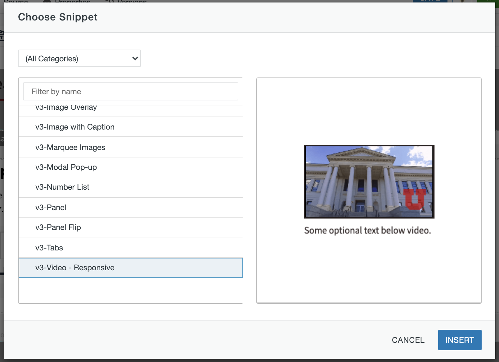
Example of Responsive Video Snippet
Hosting options
To prevent loading errors, videos should be hosted on a streaming server such as YouTube, Vimeo or Mediaspace, the university's streaming server.
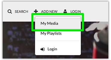 Visit https://mediaspace.utah.edu.
- Select My Media and log in using your uNID and password.
- Click Add New from the navigation menu and follow the screen prompts. Add a description and add
any applicable tags. Save your video's details.
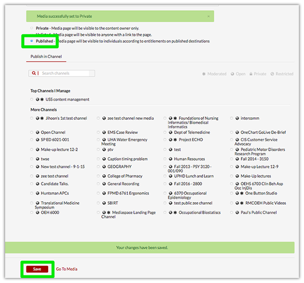 Once saved, publish the video by selecting the radio button labeled Published. This will make the video viewable by visitors to your site.
- Click Save to publish the video.
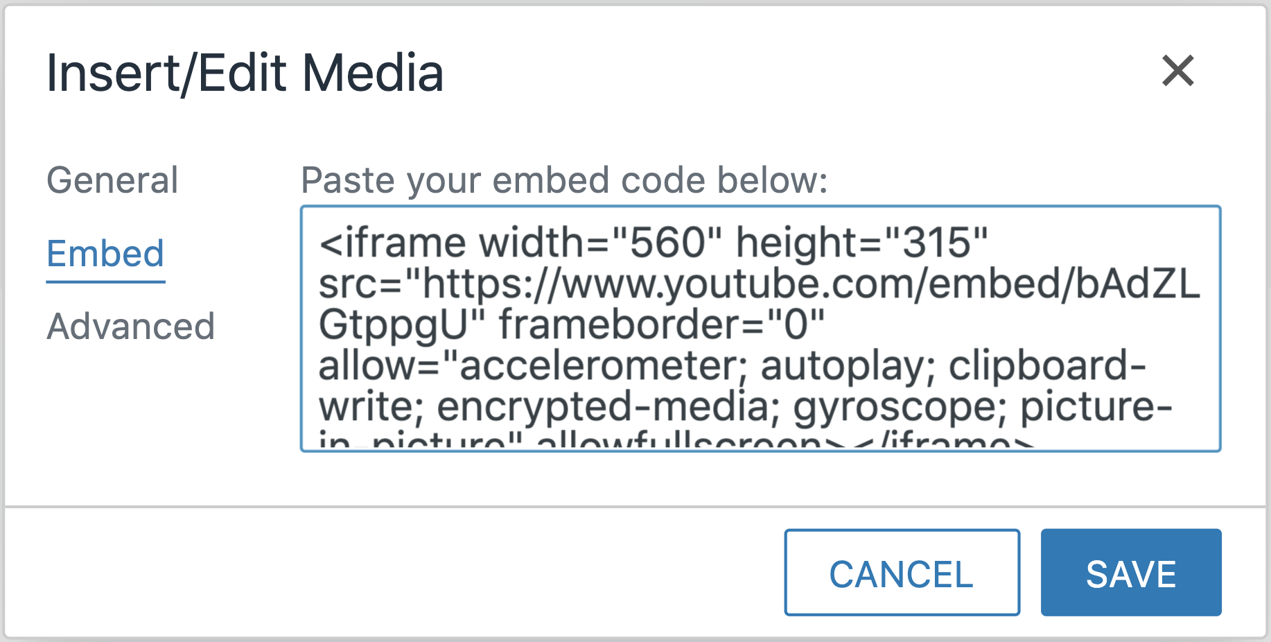
Note: you may need to select a channel before the Save button will be activated. - Navigate to the desired video and copy the embed code to be pasted into the Insert/Edit Media box.
- If your video is for a marquee, publish it an then request a custom URL from TLT:
adam.stewart@utah.edu.
Please note the existing Mediaspace URL will not work in the marquee.
Please note: A YouTube account is required to upload videos. Use of other videos not uploaded/owned by you may result in a copyright violation.
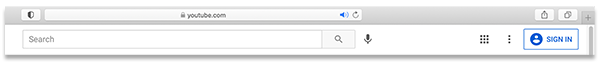
1. Navigate to https://www.youtube.com/ and click Sign In.
2. Once logged in, click on the video camera icon and select Video Upload. 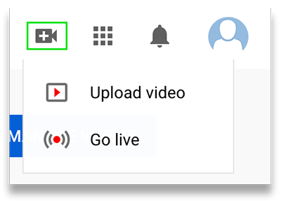
3. Locate the video file you wish to upload and follow the screen prompts including Details, Video Elements, and Visibility. Click Publish.
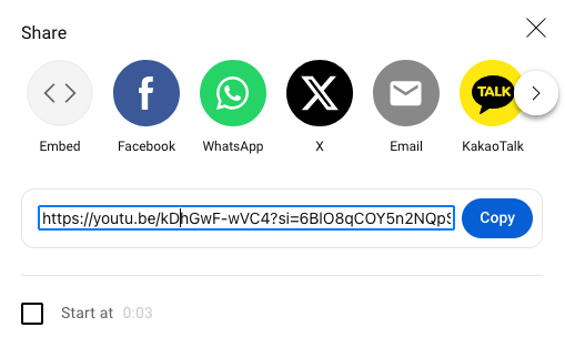
4. Once your video is published, open the link where your video is housed.
5. Click Share and then copy the URL provided.
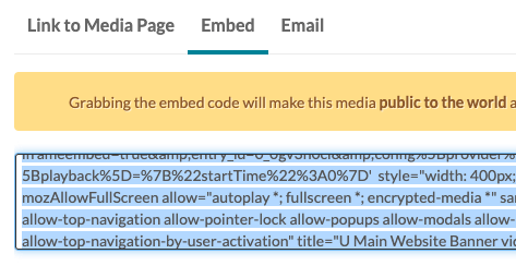
Optionally, you can copy the embed code to be pasted into the Insert/Edit Media box.
Please note: A Vimeo account is required to upload videos. Use of other videos not uploaded/owned by you may result in a copyright violation.
1. Visit https://vimeo.com and click Log In.
2. Click on New Video, locate the video file you wish to upload, and follow the screen prompts.
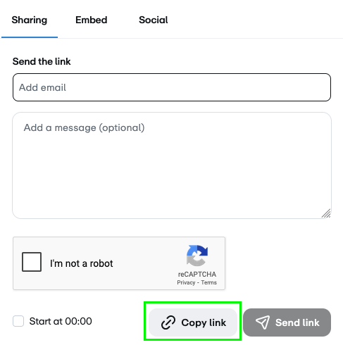
3. Once your video is published, select Copy link.
Optionally, you can copy the embed code to be pasted into the Insert/Edit Media box.
If you chooose to use the embed code, the video can be placed on the page without
the responsive video snippet. Start with Step 4 below.
Creating a responsive video
Step 1:
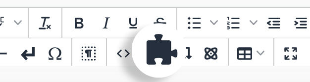
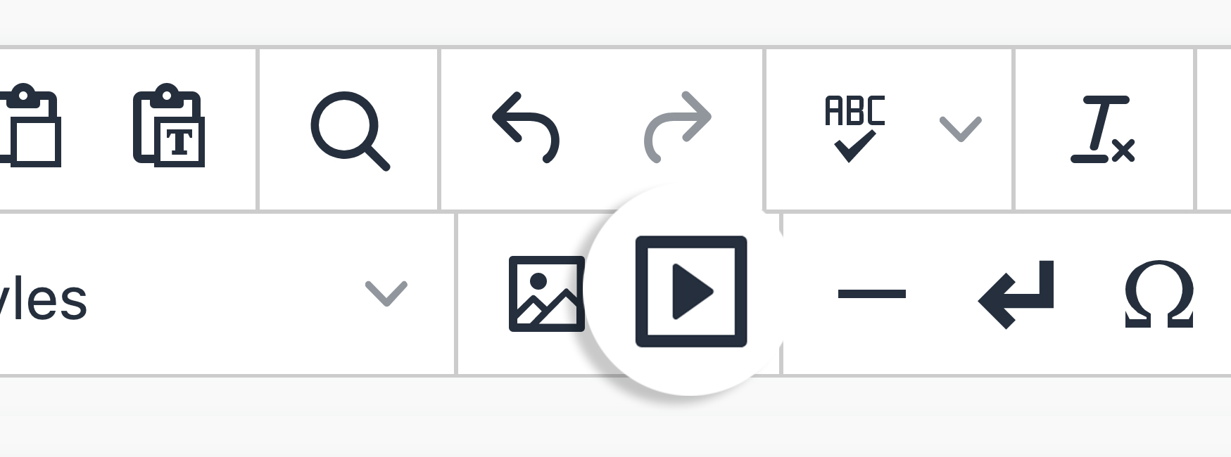
On the page you're editing, click on the Snippets icon in theWYSIWYG Toolbar.
Step 2:
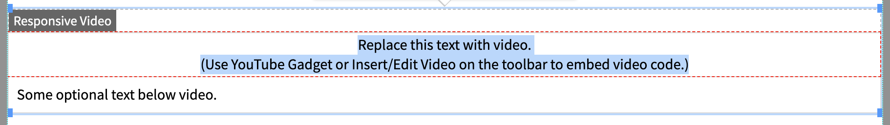
Select Video - Responsive and clickInsert.
Step 3:
Delete the default text in the upper cell of the snippet.
Step 5A:
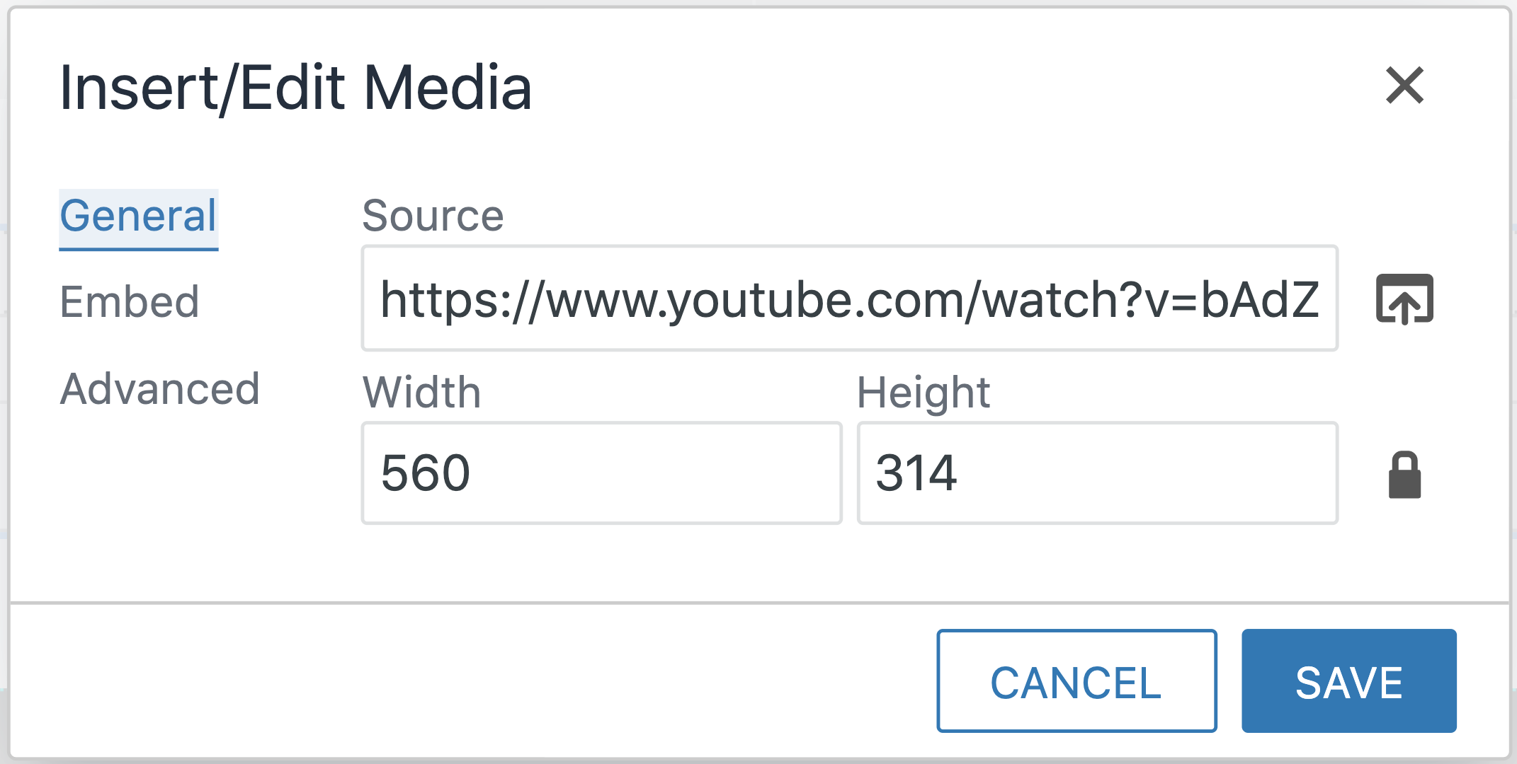
If you are linking from an external host, Copy and paste the URL of the video/audio. Resize if needed.
Click Save.
Step 5B:
If you have uploaded your video, browse for the video within the site. Resize if needed. Click Save.
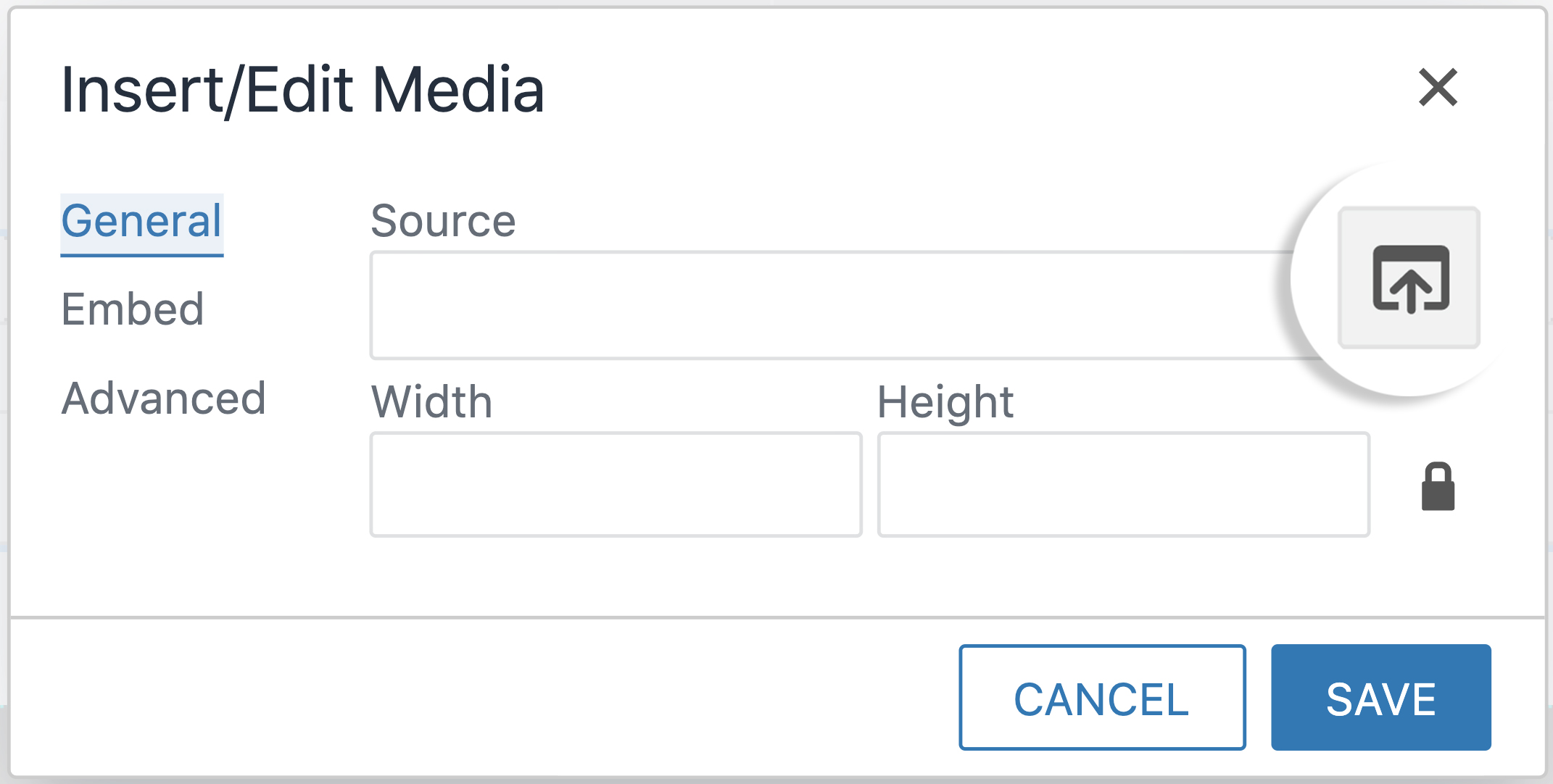
Step 5C:
If you are using an embedded code, click Embed and then copy and paste the code. Resize if needed and then click Save.
Step 6:
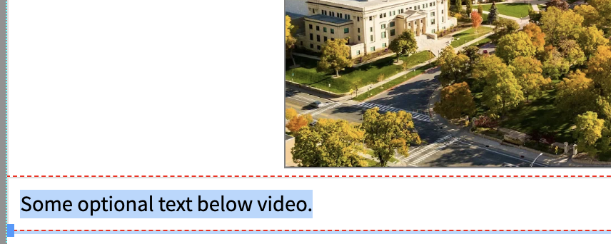
Optional: Add text below the video.
Step 7:
Click Save to view changes.
Ways to style a video
Add classes in the table properties of the video to create different styles. These can be used in combination or on their own.