Getting Started: The Interface
The version 11 interface
Version 11 features a modern interface with added space to work and improved accessibility without changing the way your site functions.
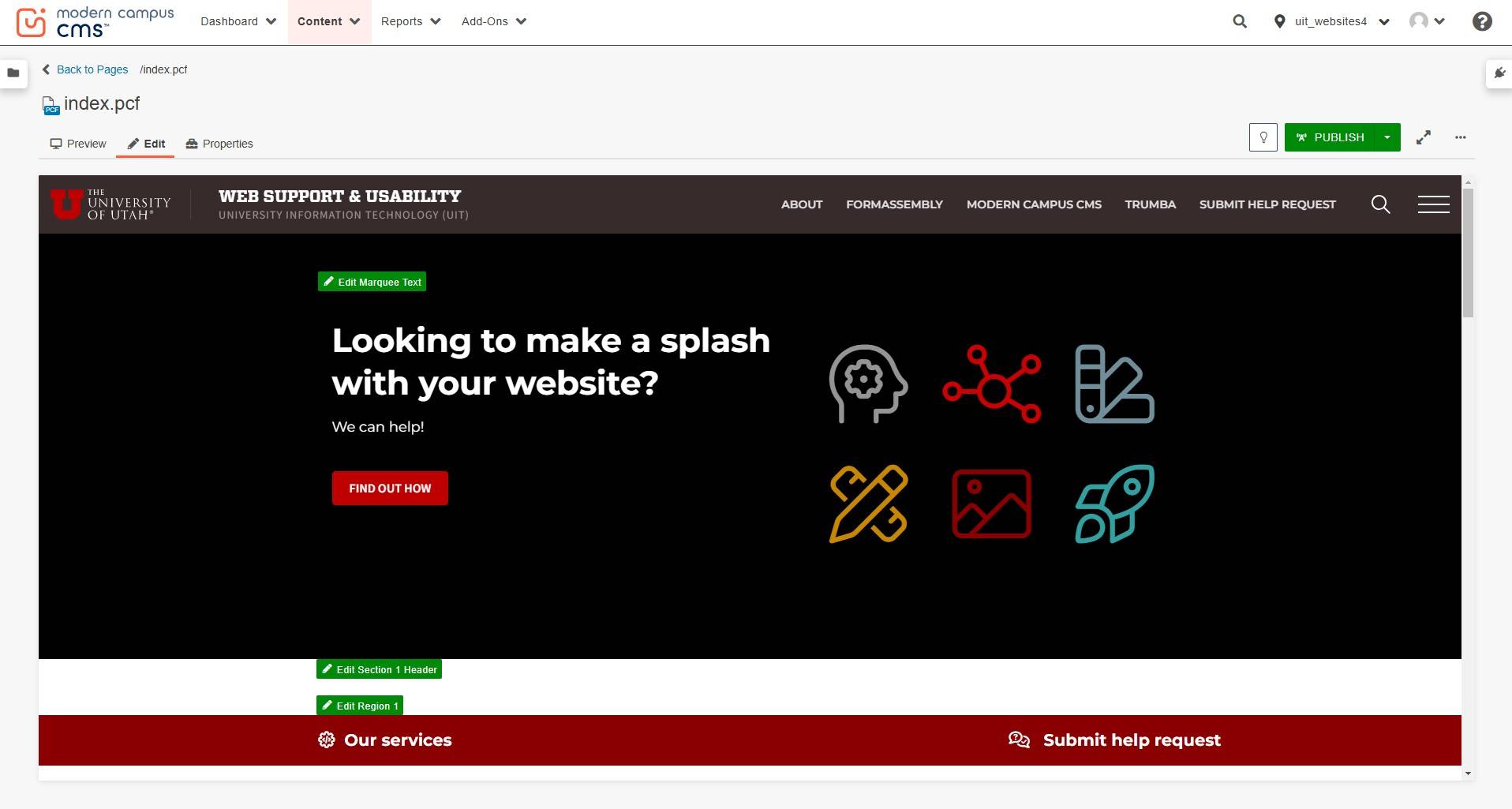
Overview
Global Navigation Bar
This is what you will use to navigate through the platform.

File Name and Extension
This is the name of the file you currently have open.
Note: PCF stands for Publish Control File and becomes PHP on production.

Tabs/Page Actions Toolbar
Clicking on these tabs will give you different ways of viewing your content.
- Preview is how the page will render once published
- Edit is how you can make changes to your page
- Properties is the back-end setup for the page, including your metadata
- Versions shows previously saved or published versions of the page

Check-in/Check-out
In order to start editing a page, the page must first be available to edit. Only one editor is allowed to edit a page at a time, and if you click into an editable region, the page will automatically get checked out to you.

Editable Region(s)
The green edit buttons will show you the area(s) you can edit on your page. It will open up that area in a WYSIWYG (what you see is what you get) Editor and will look very similar to that of a document editor.
Sites Dropdown
This area is meant for those who have access to edit more than one site. Using the dropdown, you can navigate to other sites without having to manually log in through each site.

Gadgets
This area is for applications--items that will make it easier for you to edit your page. To add gadgets, click on the gear icon and then select the checkbox for each gadget you'd like to display.

Save - Saves the file on the staging server and exit the Editor.

Exit - Leave the file without saving changes.

Cut - Removes content from the document.

Copy - Copies content from the page.

Paste - Pastes content onto a page.

Paste as Plain Text - Pastes as plain text. Use this when copying and pasting text from documents.

Find - Searches for text on the current page.

Undo - Removes the last changes made.

Redo - Redoes changes made.
Spell Check - Checks the spelling within a region.
Remove Formatting - Removes all formatting for a selection.

Bold - Applies bold formatting to selected text.

Italic - Applies italicized formatting to selected text.

Underline - Applies underlined formatting to selected text.

Strikethrough - Applies Strikethrough formatting to selected text.

Unordered List - Turns the selected text into an bulleted list.
Ordered List - Turns the selected text into a numbered list.

Outdent - Decreases the indent of a paragraph.

Indent - Increases the indent of a paragraph.
Superscript - Formats the selected text as superscript text.
Subscript - Formats the selected text as subscript text.

Align Left - Aligns a block-level element such as a paragraph or a heading to the left margin.

Align Center - Aligns a block-level element such as a paragraph or a heading centered within the left and right margin.

Align Right - Aligns a block-level element such as a paragraph or a heading to the right margin.

Align Full - Justifies text making it flush on both the left and right side.

Insert/Edit Link - Links text or images to internal/external URLs.

Unlink - Removes a hyperlink.

Email Link - Creates a mailto link.

Anchor Link - Creates an anchor to a select portion of your page.

Help - Displays help text for the WYSIWYG Toolbar.
![]()
![]()
Dropdowns - Allows for an element to be applied to text by selecting the element from the list.
Note: Paragraph dropdown assigns meaning (H1, H2, etc.).

Insert/Edit Image - Adds/edits an image on your page.

Media - Allows users to include markup for video, movies, and audio on a page.

Horizontal Line - Places a horizontal line that fills the width of its container and is a useful way of separating areas of a page.

Line Break - Creates a soft return or line break without the padding included in a paragraph break.

Special Characters - Opens a dialog box that contains alphabetic characters with accents and diacritical marks used to indicate different pronunciation than the letters are usually given.

Show/Hide Blocks - Enables the ability to toggle the view of the WYSIWYG Editor to display block elements encapsulated within rectangles defined with thin, dashed lines and identified them with the label of the HTML element being used.
Source Code - Provides quick access from the WYSIWYG Editor to the HTML mark-up for an editable region of a page for editing the HTML source code.

Snippets - Snippets are pieces of predefined content that can be selected using the Snippet tool in the toolbar or the Snippets Gadget. Snippets add more flexibility to the layout and design of a page.

Assets - Allows users to create and use reusable content such as text, images, media, code blocks, managed forms, image galleries, polls, and comments that can be edited in one location and used in an unlimited number of pages.

Components - Components are predefined content items that are configured by selecting options to customize the item's appearance or function.
Table - Includes the standard tools for editing tables such as the ability to insert, delete, and define rows and columns, as well as merge or split table cells.

Maximize Content Region - Enlarges the content editing area to its maximum size within the editor and toggle off to revert content area to actual size.

