Snippets Library: Grid Filter and Grid Filter Control
What is a grid filter?
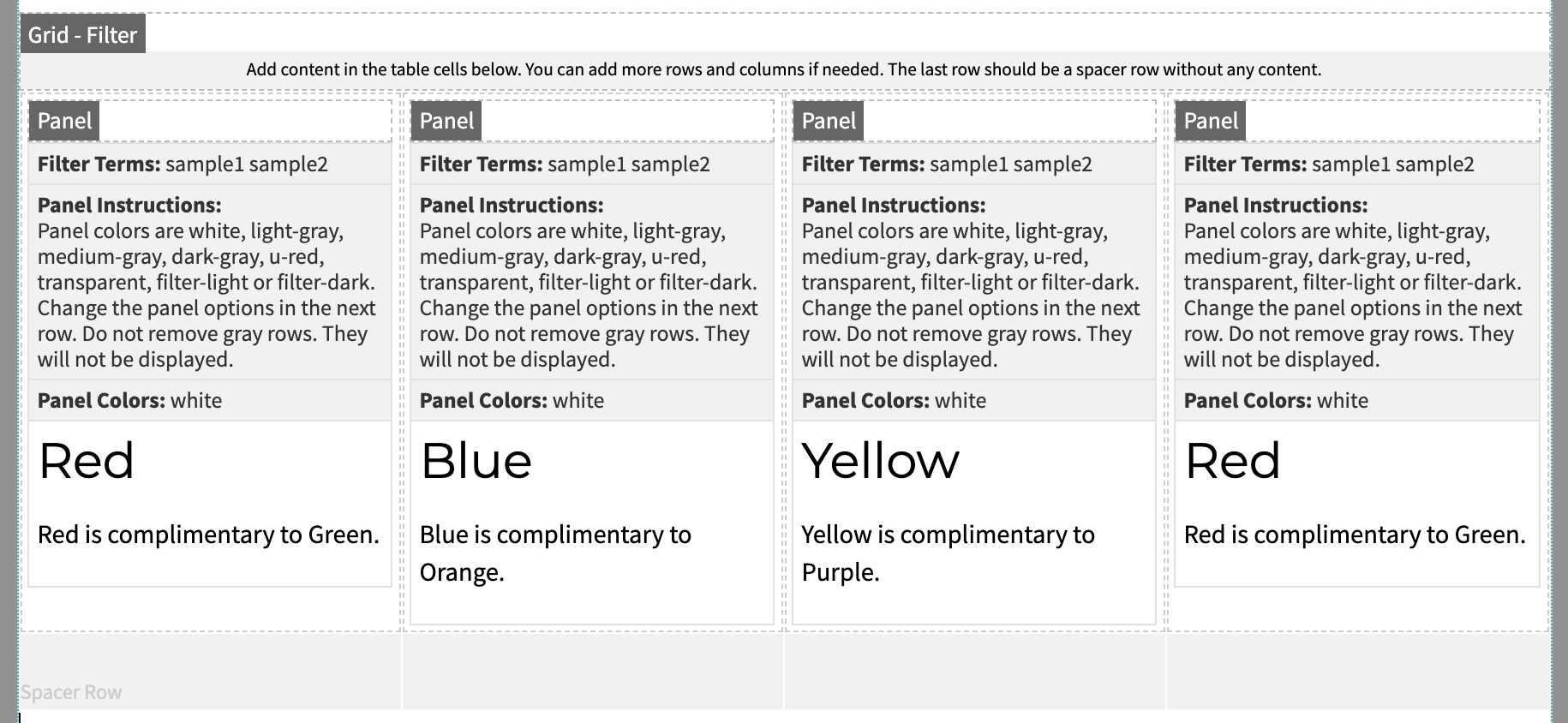
A grid filter can display a maximum of six cells in a row with endless rows in a column. A grid filter should be used in combination with a grid filter control such as either the Filter - Select or Filter - Checkboxes. This allows for information to be filtered on a page while in contained cells.
Please Note: You can only use one grid filter on an individual page. The example below
includes the optional filter control buttons.
Red
Red is complimentary to Green.
Green
Green is complimentary to Red.
Yellow
Yellow is complimentary to Purple.
Blue
Blue is complimentary to Orange.
Creating a filter checkbox or filter select
Step 1:
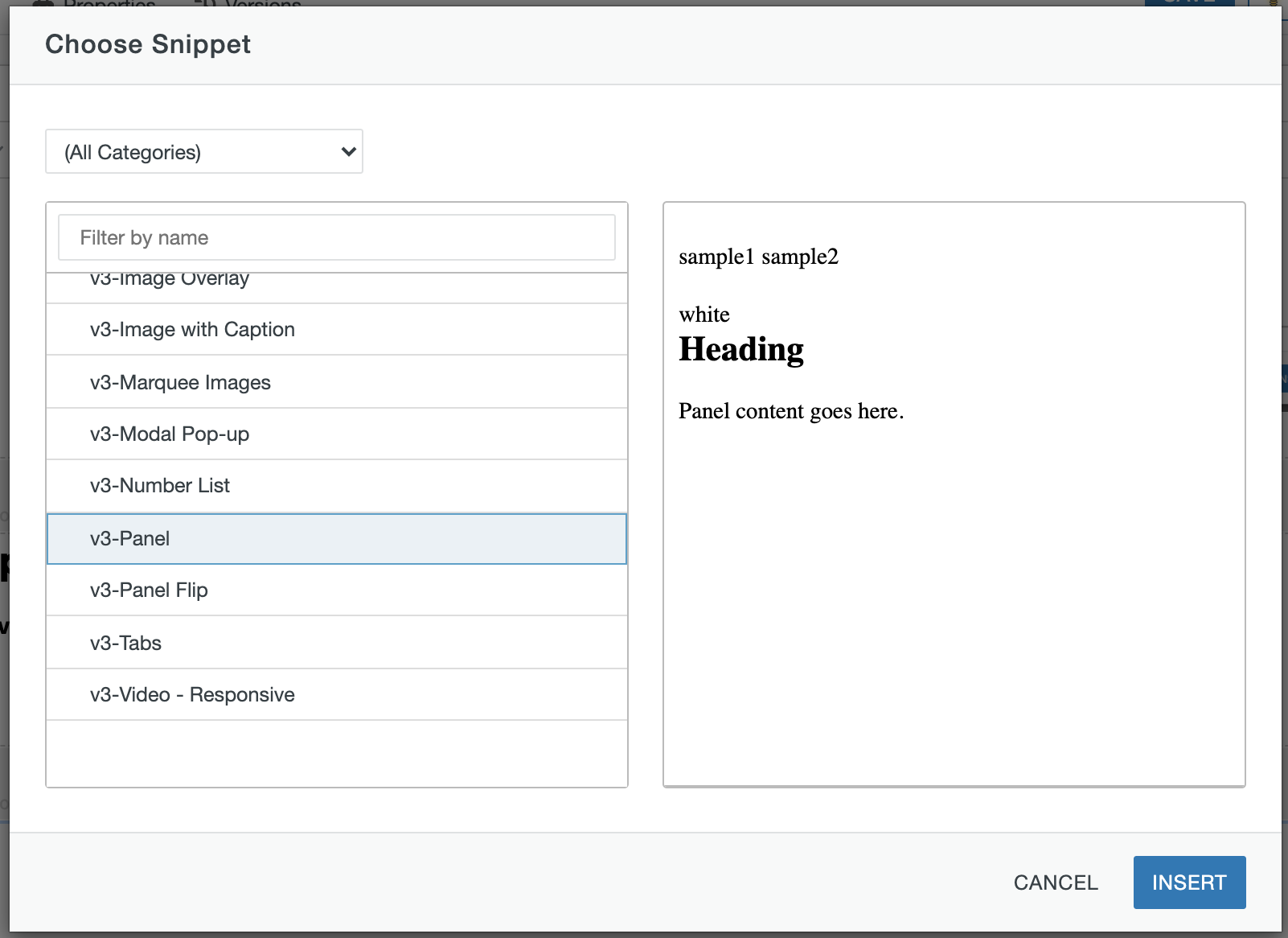
On the page you're editing, click on the Snippets icon in the WYSIWYG Toolbar.

Step 2:
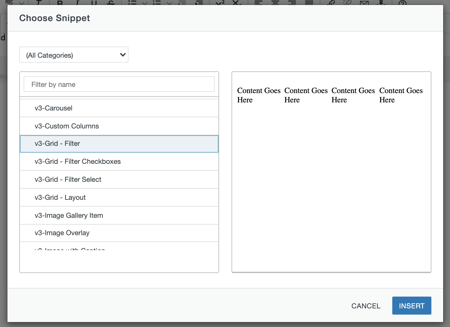
Select Grid - Filter Checkboxes or Grid - Filter Select and click Insert.
Step 3:
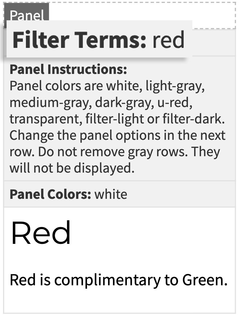
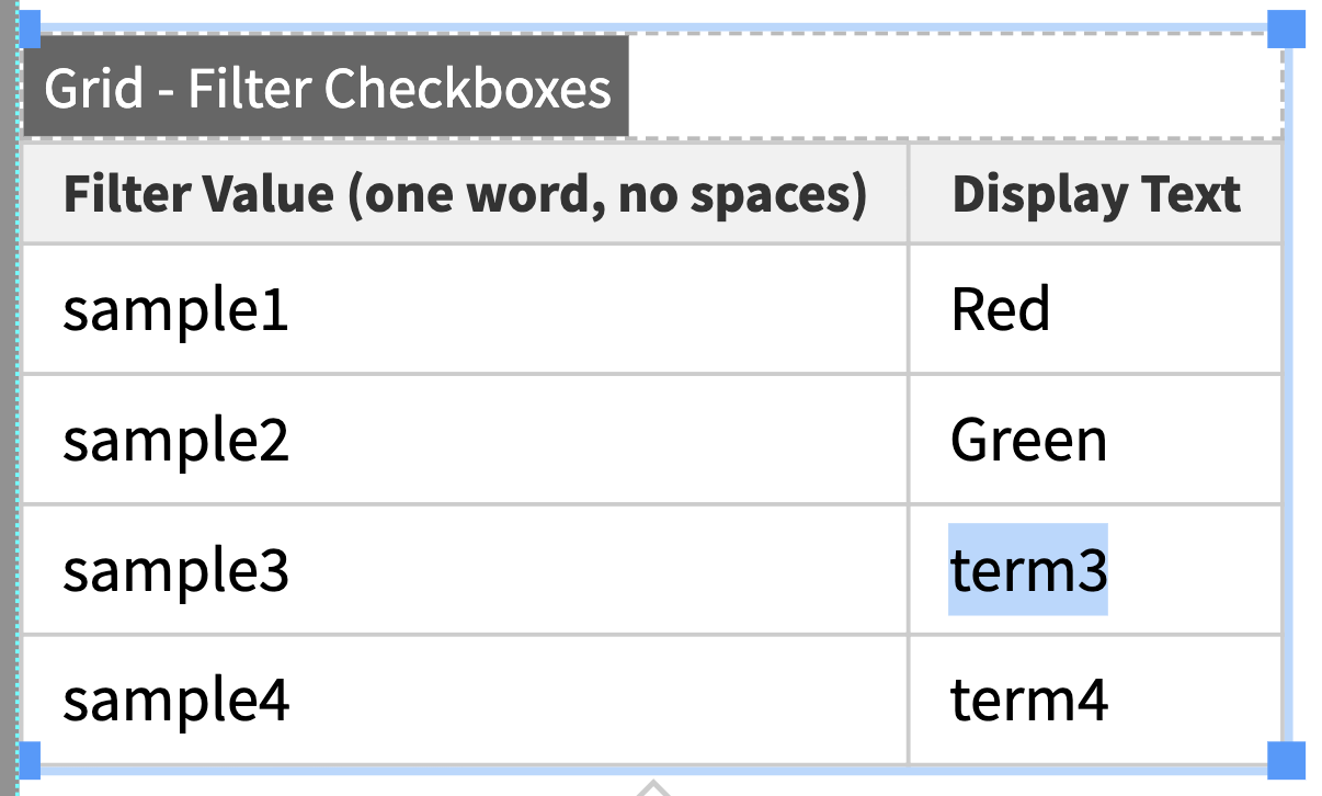
Determine the categories for the filter, then replace all default text in the Display Text column.
Note: you can turn on the optional "select all" and "deselect all" control buttons by adding the "control-btns" helper class to this snippet.
Step 4:
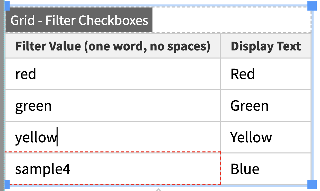
Replace all default text in the Filter Value column - one word, no spaces.
Adding and deleting rows
Step 1:
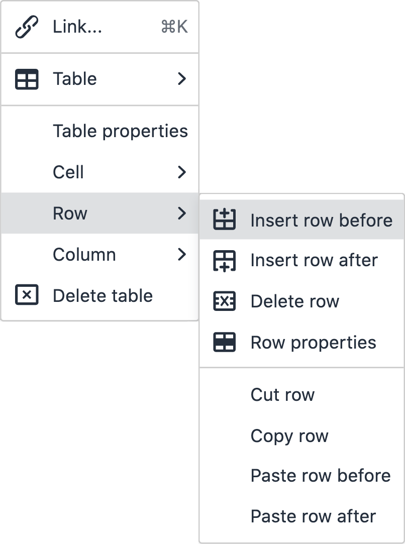
To add more filters or additional rows, use the quick icon menu above/below the snippet.

Or right click on the preferred row and go to Row→ Insert Row After or Insert Row Before.
Step 2:
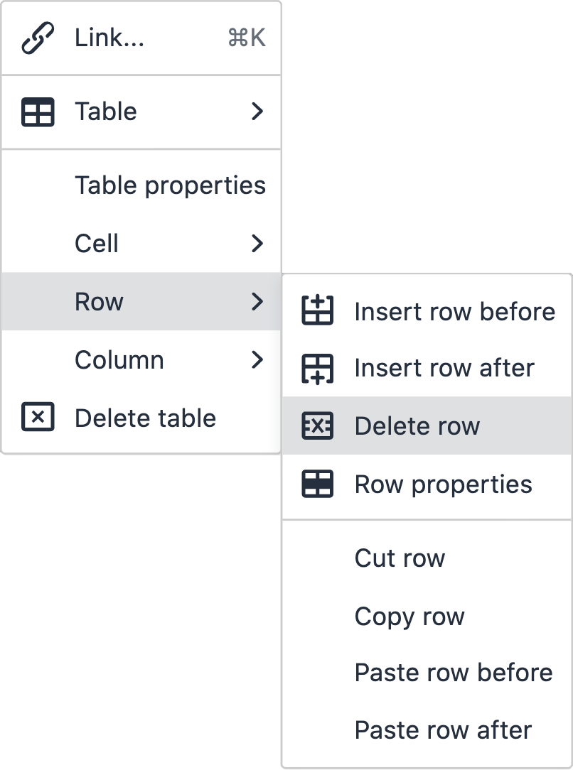
To delete a filter or row, use the quick icon menu above/below the snippet.

Or right click on the preferred row and go to Row→ Delete Row.
Ways to style a grid filter
You can add classes in the table properties of the grid filter to customize the appearance.

