Enhancing Web Design with Grids, Columns, and Tables
Bits & Bytes Recap
Overview
 In April, we explored the effective use of tables, custom columns, and grid filters
in web design. This overview will provide key concepts and practical tips to enhance
your web pages. We created a Grid, Table, and Column Examples page to illustrate the concepts discussed below.
In April, we explored the effective use of tables, custom columns, and grid filters
in web design. This overview will provide key concepts and practical tips to enhance
your web pages. We created a Grid, Table, and Column Examples page to illustrate the concepts discussed below.
Tables
Tables are an excellent tool for presenting data in a clear and organized manner. Common applications include scientific data, event schedules, course requirements, and product/service comparisons. In our example, we compare our team’s affinity for various fandoms using a table with four columns and icons indicating our level of interest.
Key Setup Steps:
- Structure: Define the number of columns and rows in the WYSIWYG editor.
- Customization: Add custom classes to the table properties for styling. For this example we used "Table - Bordered & Striped with Dark Header".
Accessibility Considerations:
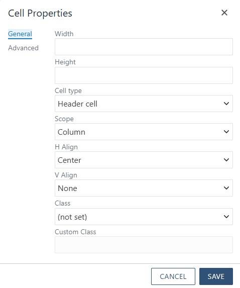
- Header Cells: Ensure columns and rows designated as headers have the appropriate cell properties:
- Cell Type: Header Cell
- Scope: Column
- Icons: Include an icon description for Font Awesome icons for screen readers to interpret correctly.
- Color Usage: Do not rely solely on color to convey information; use images and text (or sr-only text) to ensure clarity.
By following these guidelines, you can create accessible and informative tables for your users. For more information on how to create tables, check out our Responsive Tables Walkthrough.
Custom Columns
Custom columns are versatile design elements and can even be used on marquees. This approach allows for strategic image placement and ensures important information is highlighted.
Implementation Steps:
- Panel Setup: For this specific design, we placed all our content into a panel. This panel is where most of our styling is and allowed the panel to span the full width of the page, flush with the top.
- Column Configuration: Within the panel, we created custom columns. For our example, a 40|60 width ratio was set by right-clicking in the column and selecting Cell Properties or using the WYSIWYG toolbar.
- Content Addition: Add images and text within the columns. We used the “img-cover” class to ensure the image included filled its designated space.
This method provides flexibility in design, enabling creative layouts for cards, marquees, and page breaks. For more information on how to create custom columns, check out our Custom Columns Walkthrough.
Grid Filters
Grid filters are powerful tools for managing large lists of items, allowing users to filter content efficiently. Although initially complex to set up, they offer significant benefits for user navigation.
Setup Process:
- Filter Options: Add filter options (checkboxes or dropdowns) and define filter items along with their tag names.
- Grid-Filter Snippet: Insert the grid-filter snippet and determine the number of boxes needed.
- Panel Addition: Add a panel to each box, which will contain the tags used for filtering.
- Content Integration: Populate the grid with content as you would in any column or grid layout. Customize colors to match your site's design theme by using our Helper Classes for Grid Filters and Panels.
Pro Tip: Since grid filters use an “OR” function, consider adding distinguishing text or icons to help users differentiate between items.
For more information on how to create grid filters, check out our Grid Filter & Filter Control Walkthrough.
Q & A
Q: When should I have rows be header cells? How do I make those header rows accessible?
A: There is not straightforward answer to this question. Generally, tables are used to easily and quickly show information for a user. If the information in the table becomes confusing for those who don't use assistive technology, it will most likely be confusing for those who do. The type and amount of information really is the deciding factor for if you include header rows. Our advice would be to review the content and assess how it is being (or will be) presented is the best option for all users.
If you do end up having a table that will have header rows, you will use the same process for column rows but instead of having the Scope be Columns you would have it be Rows. This isn't a big change, but it is an important one. If you have specific styling for headers, that styling would also be reflected on the header rows.
Q: Should I put an icon description on all the icons I use?
A: Adding an icon description is all dependent on why you are using the icon. If you are using the icon to add some personalization to the page but it does not serve an actual purpose, then it would not need an icon description. If your icon does carry meaning, like our table example, then an icon description would be needed to convey that meaning to all users. When in doubt, add a description. It won't hurt the page to have some additional information available.
Conclusion
While we covered these topics briefly, our goal is to demonstrate that tables, custom columns, and grid filters are manageable and highly customizable. Experiment with various designs and nesting techniques to discover new possibilities. If you have any questions or need assistance with specific designs, please reach out to us for recommendations.
Happy Designing!